An office design in a massive company like those in the manufacturing industry are much harder to plan than they first appear.
A conventional corporate office is usually occupied by people doing variations of office work. They meet, focus, make calls, collaborate, eat lunch, and go home.
A manufacturing or operations-based company is different.
One side of the building may have people working at desks for most of the day. On the other side, employees might be assembling products, receiving deliveries, testing equipment, moving materials, or walking back and forth between the warehouse and office.
Those two environments have very different needs.
And yet they still belong to one company.
That’s where good office design becomes less about creating a beautiful administrative area and much more about figuring out how the entire business fits together.
We’ve worked on enough of these projects to know that the line between “office” and “operations” needs attention early. If it’s ignored, you can end up with an impressive front office that makes daily work unnecessarily difficult for the people moving between the two sides of the business.
The building may look finished.
The workflow won’t feel finished.
Start With Who Crosses the Office and Operations Boundary
One of the first things I want to know is who actually moves between the office and operational areas.
Not everybody does.
An accounting employee may spend almost the entire day in the office. A project manager might go into the warehouse ten times. Someone in purchasing could need frequent contact with receiving.
That distinction starts shaping the plan.
If the employees who communicate with operations most frequently are sitting at the opposite end of the office because that happened to be where we had room, we’ve introduced unnecessary movement into every working day.
A few extra steps once don’t matter.
Repeated fifty times a week, they do.
This is why commercial interior design needs to understand the company’s actual workflow before deciding where departments belong.
The organizational chart is useful.
The movement chart is better.
Draw the Workflow Before You Draw the Walls
There’s an exercise we often do mentally during early planning.
Take one task and follow it.
Maybe a customer order enters through the administrative team. It needs technical review. Someone in operations receives the information. A product moves into assembly or testing. Something changes, and the employee handling the customer needs an answer.
Where are those people located?
How do they communicate?
Does someone need to walk through reception every time they go between departments?
That starts exposing problems before the floor plan becomes precious.
A commercial interior designer shouldn’t only ask how many private offices a client wants. We need to know which office needs to be close to what.
That’s the difference between fitting a program into a building and designing around how a business operates.
The Door Between the Office and Warehouse Matters More Than It Looks
This sounds like a tiny detail.
It isn’t.
Where the main connection between office and operations is located can influence the entire workplace.
If that doorway lands beside reception, operational traffic may constantly move through a client-facing area.
If it’s hidden at the far end of the building, employees who use it frequently may spend too much time walking.
Then there’s what happens directly around the door.
Do employees come through carrying equipment?
Are safety shoes required on one side?
Does noise enter the office every time the door opens?
Is there somewhere to put coats or personal protective equipment?
Those questions affect the surrounding space.
I’d rather deal with them on the plan than discover later that the copy room has accidentally become the place everyone drops their safety gear.
Case Study: Myostat Motion Control
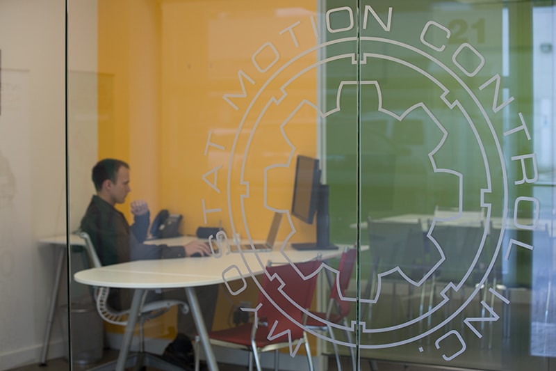
Myostat Motion Control is a good example because the workplace had to support both office work and manufacturing operations.
The Newmarket project is approximately 5,000 square feet and was completed over a 25-week timeframe. The renovation included seven offices alongside a substantial assembly warehouse, with two new washrooms and a shower intended to support employees who commute actively.
That combination immediately changes the office-design brief.
We weren’t planning an isolated administrative suite.
The office had to belong to a company where operational work was happening in the same facility.
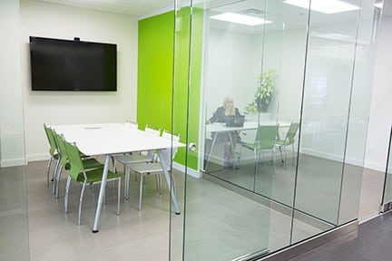
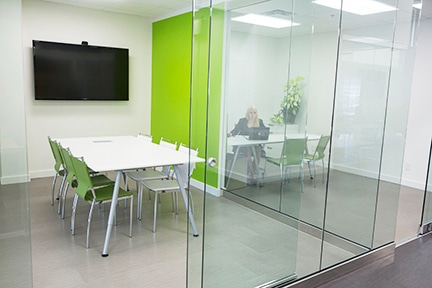
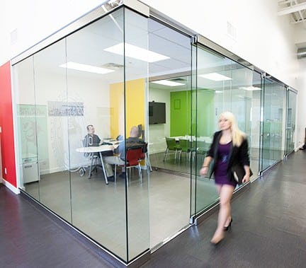
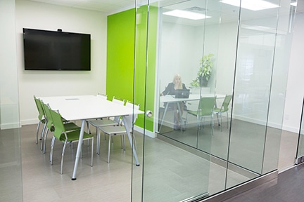
One of the strategies used throughout the office was glass-fronted private rooms, which helped natural light move deeper into the workplace rather than being trapped along the perimeter. Adjustable-height desks were incorporated for employees, and a centrally positioned kitchen was designed to accommodate up to ten people.
Those may sound like separate design decisions.
They aren’t.
They’re all responding to how the team spends the working day.
Don’t Put All the Good Space on the Office Side
This is something I think manufacturing workplaces sometimes get wrong.
The administrative office gets the nice finishes.
The operational area gets whatever is left.
I understand why it happens. Clients and visitors are more likely to see reception and meeting rooms.
But employees see everything.
If one group gets daylight, comfortable break areas, good acoustics, and thoughtful amenities while another group spends eight hours in a purely utilitarian environment, the difference becomes obvious.
The design doesn’t have to make the warehouse look like a lounge.
That would be impractical.
But shared staff amenities can help create some equality between the groups.
A properly located lunchroom is a good example.
If it becomes neutral territory between office and operational staff, it can do something organizational that a conference room can’t.
People meet there naturally.
That matters.
Shared Spaces Should Actually Be Shared
We think carefully about where kitchens and staff areas land in these projects.
Put the kitchen too deep inside the administrative office and warehouse employees may rarely use it.
Move it too far toward the operational side and office staff may feel the same way.
At Myostat, the central kitchen was designed as a communal hub and sized for approximately ten people.
The location is as important as the millwork.
A shared amenity can become one of the few places where departments that don’t sit together actually interact.
That’s useful.
And it doesn’t require a formal collaboration room with a catchy name painted above the door.
Sometimes people just need somewhere sensible to eat lunch.
Noise Needs to Be Planned at the Source
Manufacturing businesses introduce an acoustic condition that conventional offices don’t always have.
The noise may be coming from somewhere outside the office itself.
Equipment.
Assembly.
Deliveries.
Warehouse activity.
Now imagine putting the most concentration-heavy department directly against that dividing wall.
We can add acoustic materials afterward, but we should first ask whether the adjacency makes sense.
This is a principle we use across office interior design.
Fix the zoning first.
Then fix the surface.
A properly designed partition between office and operational areas may need very different construction from a decorative partition between two office rooms. Door selection matters too, because a high-performing wall with a poor door can undermine the whole idea.
This is where the commercial construction team needs clear information from the design documents.
“Provide wall” isn’t enough.
The wall has a job.
Glass Is Useful, but Don’t Use It Everywhere
Glass office fronts can be extremely useful in an industrial or manufacturing workplace.
They allow natural light to travel farther into the space and can help smaller offices feel less enclosed.
That was part of the strategy at Myostat, where glass partitions were used throughout the private offices to maintain brightness and visual connection.
But I wouldn’t automatically specify glass everywhere.
There are rooms where visual privacy matters more.
There are situations where glare becomes annoying.
And depending on the partition construction, acoustic privacy may need closer attention.
The decision should come from the function of the room.
Not because glass offices are fashionable.
Give Employees a Place to Change Their Mode
There’s a practical detail in the Myostat project that I like because it says something about how design responds to actual people.
One of the two washrooms included a shower for commuters.
That’s not a huge architectural gesture.
It’s useful.
Someone cycling to work doesn’t need a mural telling them the company supports wellness. They need somewhere to shower.
This is where I think good office interior design becomes very concrete.
Ask what employees are actually doing before and after they sit at their desks.
Are warehouse employees changing footwear?
Do employees bike to work?
Does anyone need lockers?
Are coats currently being hung on the backs of chairs because nobody planned anywhere else?
Those details aren’t decorative.
They affect whether the workplace feels considered.
Think About Dirt Before Picking the Flooring
The transition between operational and office environments affects finishes.
A beautiful pale carpet immediately inside a warehouse access door may not stay beautiful for very long.
People track things in.
That’s reality.
So we think about where resilient flooring makes sense, whether there should be a proper transition zone, and where carpet actually begins.
This doesn’t mean industrial workplaces need to look industrial everywhere.
It means the material strategy needs to acknowledge what happens on the other side of the door.
I’d rather use the more durable finish for another 6 feet than replace stained flooring prematurely because the rendering looked cleaner with one continuous material.
Don’t Treat Storage as an Office-Only Problem
Operational workplaces tend to accumulate things.
Samples.
Documents.
Packaging.
Parts.
Safety supplies.
The mistake is allowing those items to slowly migrate into whichever room has space.
Then six months later the meeting room credenza is storing spare equipment and the employee coat closet has somehow become inventory storage.
Storage needs ownership.
What belongs in the office?
What belongs in operations?
What genuinely needs to sit at the boundary because both teams use it?
That’s where the planning gets more specific.
Shared storage should be close enough to be convenient but not directly in a circulation path.
And if something is heavy, dirty, or moved frequently, don’t design an elegant office cabinet for it just because that cabinet happens to be nearby.
Use the storage that fits the job.
Office Furniture Should Respond to Different Types of Work
A manufacturing company may have some employees who rarely leave their desks and others who sit down only for portions of the day.
Why give them identical workstations?
At Myostat, adjustable-height desks were integrated throughout the workspace, giving employees more ability to change posture during the day.
For other projects, the furniture strategy may vary by department.
Someone doing detailed computer work may need more desk depth and multiple monitors.
A supervisor who spends most of the day on the operational floor might need a smaller touchdown workstation.
The temptation is to choose one workstation size because purchasing becomes easier.
Sometimes that’s fine.
Sometimes you’re spending extra square footage giving people furniture they don’t need.
A good office furniture plan should follow the work.
Be Careful With the Office-Warehouse Window
Clients sometimes like the idea of putting interior glazing between the office and operational areas.
It can be a great feature.
You get visual connection to the work.
Visitors understand what the company actually does.
Managers can maintain some awareness of activity.
But here’s where it gets tricky.
What’s the view?
If the glazing looks directly at a loading zone filled with pallets and waste bins, we haven’t created the inspiring visual connection everyone imagined.
Sightlines need to be designed from both directions.
Sometimes a window works beautifully.
Sometimes keeping the separation opaque is the better choice.
Transparency should have a purpose.
Plan the Client Route Separately From the Staff Route
Manufacturing workplaces often host vendors, clients, technicians, delivery drivers, and job candidates.
They don’t all need the same route through the building.
A client may arrive at reception and move directly into a meeting room.
A delivery driver may need access to receiving without passing through the office.
An employee might enter through another door entirely.
Those paths are worth drawing separately.
If everybody uses one route, reception can become a traffic intersection.
That’s especially distracting in smaller offices.
We try to protect client-facing space without making the rest of the building inconvenient for the people who work there every day.
Pay Attention to Where the Clean Workplace Ends
There is often a subtle threshold between the administrative side of the company and the operational side.
We want that threshold to feel intentional.
It may involve flooring.
A door.
Storage.
Different lighting.
Sometimes there’s a small transition area.
The point isn’t to create a dramatic boundary.
It’s to avoid having operational spillover gradually creep into the office.
Once that happens, the reception storage closet starts holding warehouse items, and suddenly nobody knows where things actually belong.
Boundaries help.
Mechanical Systems Should Be Discussed Earlier Than Usual
The office and warehouse may have very different heating, cooling, and ventilation conditions.
That’s outside the interior designer’s scope to engineer, but it absolutely affects our coordination.
A private office that sits against an operational space may behave differently from one on the building perimeter.
A meeting room with a door closed and six people inside has a different load from the open warehouse beyond it.
That’s why design build coordination becomes useful.
The interior plan can’t be developed as though mechanical and electrical systems will simply adapt themselves later.
We need consultant and contractor input at the appropriate stage.
Move the room now if necessary.
That’s much easier than fixing comfort complaints after occupancy.
The Warehouse Should Influence the Office Lighting Strategy
Industrial and assembly spaces can be extremely bright.
Walk directly from a very bright warehouse into a dim administrative corridor and the contrast is uncomfortable.
The opposite can happen too.
Lighting transitions deserve thought.
This is also where natural light becomes valuable.
At Myostat, the glass-fronted private offices helped distribute available daylight more effectively through the office.
I’d rather use natural light strategically than simply keep adding decorative fixtures.
Fixtures have their place.
But the basic lighting conditions need to work first.
Don’t Forget the People Who Spend Half Their Day Standing
Traditional office ergonomics usually focuses on the person sitting at a computer.
Manufacturing companies have employees who don’t work that way.
Some move constantly between the warehouse and office.
Some stand for much of the day.
Others alternate between administrative tasks and operational work.
That affects amenities.
It affects furniture.
It may even affect how close certain offices should be to operational areas.
We try to understand those differences instead of treating everyone on the employee list as one identical workstation.
That’s where working with a commercial interior designer should add value.
The plan should reflect the company.
Not an office-design template.
Build a Buffer Between Incompatible Activities
There are rooms that can do more than one job simply because of where they’re located.
Storage can become an acoustic buffer.
A corridor can separate a focused department from operational noise.
A washroom or service zone may help create distance between two spaces that don’t need direct adjacency.
This is one of those design strategies that doesn’t photograph dramatically.
But it can completely change how the office feels.
We’re using the plan itself to solve a performance problem.
That’s usually better than selecting a product afterward and hoping it fixes everything.
Design the Boundary With Construction in Mind
The office-to-operations interface is where commercial interior design starts meeting commercial construction very quickly.
Doors may need particular hardware.
Partitions may need better acoustic performance.
Different flooring assemblies meet.
Fire separations or other code requirements may apply depending on the building and uses.
Mechanical conditions can change.
We don’t guess at regulated conditions. Those need to be reviewed against the actual building, scope, applicable codes, and required consultants.
But the interior designer should recognize early that the boundary is technically important.
That’s where coordination starts.
A Design Build Approach Helps Because the Two Sides Can’t Be Designed Separately
For this type of project, design build has a practical advantage.
The interior design team is thinking about employee workflow and spatial relationships.
The construction team is looking at what those decisions require physically.
The mechanical and electrical consultants may be dealing with very different conditions on either side of the workplace.
Those conversations need to connect.
If the design team moves the main office-to-warehouse access late in the project, that may affect more than one wall.
If the contractor identifies an existing service condition, the layout may need to respond.
That’s normal.
The objective isn’t to avoid change at any cost.
It’s to make informed changes before they become expensive changes.
Don’t Design the Office as the “Nice Part” of the Building
This is probably the main thing I would tell a manufacturing client.
Don’t think of the building as the warehouse plus the nice office attached to it.
It’s one workplace.
The finishes can be different.
The environmental requirements can be very different.
The furniture certainly doesn’t need to match.
But the people should feel like they’re working for the same company.
Shared amenities help.
Consistent wayfinding helps.
Brand elements can travel through both areas without being applied identically.
Even small things like using related lighting language or repeated materials can create a connection.
The goal isn’t sameness.
It’s belonging.
A Practical Test Before We Approve the Plan
For this type of office design, we’d pressure-test the plan from several people’s point of view rather than looking only at rooms.
Person | What We Test |
Office employee | Can they work without constant operational disruption? |
Operations employee | Can they reach the people and amenities they need without unnecessary travel? |
Manager | Can they move easily between administrative and operational responsibilities? |
Client | Can they reach reception and meeting spaces without entering back-of-house areas unnecessarily? |
Delivery or service visitor | Can they access operational areas without disrupting the office? |
Employee using shared amenities | Are kitchen, washroom, locker, or change facilities reasonably located? |
This kind of test catches more than asking whether each individual room is large enough.
Because a room can work perfectly while the building doesn’t.
Why Myostat Is a Useful Office Design Example
The Myostat Motion Control project is useful because nothing about the program existed in isolation.
Seven offices had to relate to an assembly warehouse.
Natural light needed to reach office areas.
Employees needed proper workstations.
Shared space mattered enough to create a central kitchen for roughly ten people.
And even a seemingly modest addition, a shower for commuters, came directly from thinking about how employees actually use the workplace.
That’s what experienced office interior design should do.
Look past the room list.
Understand the working day.
Planning an Office for a Manufacturing or Operations-Based Company?
Before you decide how many offices fit into the front of the building, map how people move between the office and the operational side.
Find the departments that communicate most often.
Look at the door between the two environments.
Think about noise before selecting acoustic finishes. Figure out where dirt and deliveries actually travel before approving flooring.
And don’t leave office furniture until the construction drawings are almost finished.
Studio Forma works across office design, office interior design, commercial interior design, office furniture, office renovation, design build, and commercial construction coordination for workplaces throughout Toronto, Newmarket, and the GTA.
If I had to give one recommendation to a manufacturing company before they approve their office layout, it would be this:
Don’t design the office and warehouse as two separate projects.
Your employees won’t use them that way.
Frequently Asked Questions (FAQ):
How is office design different for a manufacturing company?
Manufacturing office design needs to consider the relationship between administrative employees and operational teams. Noise, circulation, staff amenities, storage, deliveries, and access between the office and warehouse can influence the layout.
Where should offices be located in a manufacturing facility?
That depends on which departments need frequent access to operations, the location of natural light, existing building services, and acoustic conditions. Employees who regularly work with operational teams may benefit from being closer to that side of the facility.
How can office interior design reduce warehouse noise?
The first step is good zoning. Focus-heavy workspaces should be separated from louder operations where possible. Appropriate partition construction, door selection, acoustic treatments, and buffer zones can then provide additional control.