Some companies have a harder office design problem than others.
If you’re a law firm, the office needs to support focused work, client meetings, privacy, and a certain level of professional confidence.
If you’re a company that manufactures, engineers, distributes, or develops physical products, there’s another question.
Where does the product fit?
I’ve seen businesses solve this by putting a few samples in reception, mounting photographs on the wall, and calling it branding. Technically, the product is there.
But that’s a missed opportunity.
For a product-led company, office design can help clients understand what the business actually does. It can give sales teams somewhere to demonstrate products, provide staff with better training environments, and make the workplace itself part of the client conversation.
The difficult part is doing that without turning the entire office into a showroom.
Because employees still have to work there.
That’s where the design gets interesting.
Start With the Business Experience, Not the Logo
When we begin office interior design for a company with a strong product or technical offering, I don’t want to start with brand colours.
I want to understand what happens when a client visits.
Why are they there?
Maybe they’re coming in for a product demonstration. Perhaps they’re attending training. They might be discussing a technical problem with an engineer before going into a meeting.
Those activities tell us far more about the space than the brand guidelines do.
The office may need a demonstration zone near reception. It might need a training space that can handle a larger group without disrupting the people working nearby.
Or the best solution may be the opposite. Keep the public-facing experience away from the main work area so demonstrations don’t interrupt the office every time visitors arrive.
There’s no universal answer.
But there should be an answer.
Don’t Turn Reception Into a Product Warehouse
One of the easiest mistakes is trying to show everything.
A company has twenty product families, so twenty product families appear near reception.
Now the first impression is clutter.
I’d rather choose a few things that explain the business well.
This is especially true with technical companies. A client doesn’t necessarily need to see every version of a product. They need enough information to understand what makes the company interesting.
The physical product can become one part of the interior architecture.
A material used in the company’s own manufacturing process might inspire a wall detail. A lighting manufacturer can use its own fixtures throughout the office instead of creating one isolated display zone.
That’s a much stronger connection.
Case Study: Cowper Engineering
Cowper Engineering is a useful example because the office needed to do several jobs at once.
The 2,700-square-foot Newmarket head office supports day-to-day work, training, client education, and product interaction. Cowper wanted visitors to experience the company’s automation technology rather than only read about it on a wall. Studio Forma
That changed the design brief immediately.
Studio Forma developed custom architectural features using materials commonly associated with Cowper’s robotics and automation work. One of the main features is a signature walkway that separates departments while also acting as a lighting feature and a strong visual element. Studio Forma
I like that kind of detail because it isn’t decoration pasted onto an office.
It’s doing work.
The walkway helps organize the plan. It reinforces Cowper’s technical identity. And it becomes something visitors remember.
One element, several jobs.
That’s the kind of efficiency we look for.
Product Display Should Be Part of Circulation
If clients are meant to experience a product, think carefully about where that experience happens.
Don’t automatically create a display wall and assume people will stop there.
People move through buildings in predictable ways.
They enter.
They look for reception.
Then someone takes them somewhere.
That route is valuable.
If we know most visitors move from reception to a training or meeting area, we can use that sequence to tell a story. The product doesn’t need to be presented all at once.
Maybe the client sees a feature near reception, another element while walking through the office, then gets the full demonstration later.
That’s much closer to how retail and hospitality spaces are planned.
Commercial offices can learn from that.
The Working Office Still Has to Win
Here’s where I become a little biased.
Employees use the office five days a week. A visitor may be there for ninety minutes.
So if the client experience starts making everyday work worse, we’ve designed the wrong thing.
I’ve seen layouts where the most dramatic product display steals valuable natural light from employees. Or the demonstration space is placed directly beside focused workstations because that’s where visitors can see it best.
It looks impressive during a tour.
Then someone has to sit beside it all year.
No thanks.
Good commercial interior design needs to balance the client experience with the people who actually occupy the workplace.
The visitors matter.
The employees matter longer.
Use Sightlines Before Adding Signage
We talk a lot about sightlines during design because they’re incredibly useful.
What does someone see the moment the elevator opens?
What is visible from reception?
Where does the eye naturally go while walking toward a meeting room?
Those views can do a lot of branding work without adding another graphic to the wall.
For a product-led company, this could mean positioning an important piece of equipment at the end of a circulation axis.
Maybe a custom feature becomes visible through a glass meeting room.
Perhaps a product wall sits behind reception but is framed so it doesn’t compete with the receptionist’s working area.
This is quieter branding.
And usually better branding.
Don’t Make the Office Look Like a Trade Show Booth
A company can be proud of its product without putting the logo on every surface.
I think technical companies are particularly vulnerable to this.
There are often strong brand colours. Large pieces of equipment. Lots of information to communicate.
The instinct becomes to use all of it.
You don’t need to.
At Cowper, the product-led story came through architectural elements and integrated displays rather than turning every wall into a branded surface. Studio Forma
That restraint matters.
A professional office still needs neutral moments.
A clean wall can make the branded moment beside it stronger.
Let the Product Affect the Material Palette
This is one of the more interesting tools we have as designers.
Instead of asking only, “What colours are in the logo?” ask, “What materials belong to this business?”
An automation company may use metals, technical components, machinery, and engineered surfaces.
A lighting company has a completely different material story.
An outdoor equipment brand might be connected to wood, greenery, textured finishes, or environmental references.
Studio Forma used this approach on Greenworks’ 20,000-square-foot East Gwillimbury office, where the workspace incorporated nature-inspired murals, custom millwork, and materials that reflected the company’s connection to outdoor products and sustainability. Studio Forma
That’s much more sophisticated than painting three walls green.
Training Space Needs to Be Designed Differently From a Boardroom
This sounds obvious until you start looking at floor plans.
A boardroom and a training room both contain tables and chairs.
But they’re not the same room.
A boardroom often supports conversation around one central table.
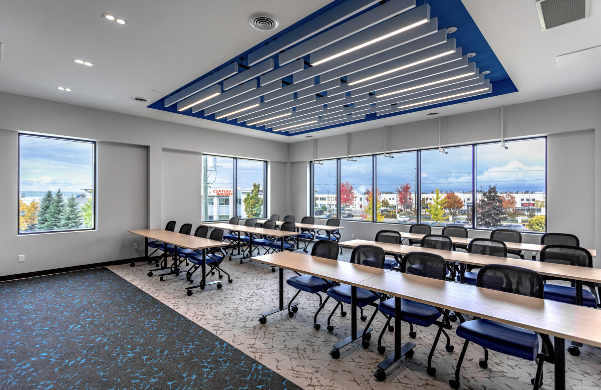
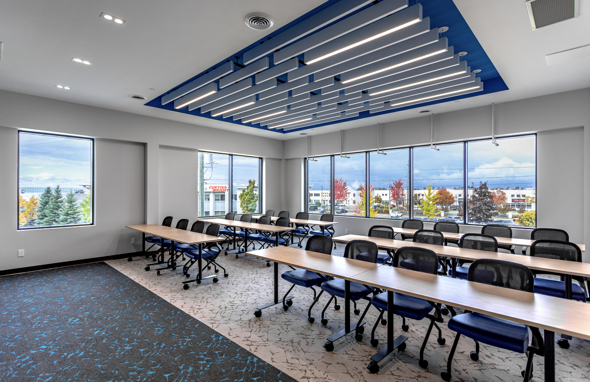
A training room may need a clear presentation wall, better sightlines, flexible furniture, equipment storage, and enough circulation for an instructor to move through the room.
Power matters differently too.
If participants are working on laptops or equipment for three hours, power can’t be treated as an afterthought.
And if technical products are being demonstrated, there may be very specific electrical, data, or clearance requirements.
Those details should reach the commercial construction drawings early.
Not the week before installation.
Product Displays Need Maintenance Space
This is one of those details nobody talks about until it becomes annoying.
How do you change the display?
A product wall may look wonderful on opening day.
But what happens when the company launches a new model?
Can someone remove the old unit without taking half the millwork apart?
If the display has lighting, where is the driver?
Can maintenance staff actually reach it?
These questions sound small during design.
They become very real later.
I’d rather leave a discreet removable panel than create a beautiful millwork detail that requires a carpenter every time marketing wants to update something.
Practical wins.
Furniture Has to Support Demonstration and Training
Office furniture becomes especially important in spaces that serve several purposes.
Let’s say a room is used for internal meetings most days, but once a month it becomes a training area for twelve clients.
Fixed furniture may not be the best answer.
A table with appropriate mobility might be smarter. Stackable or nesting chairs can help, provided there is somewhere to store them when they’re not in use.
And that last part matters.
People love specifying flexible furniture without designing storage for the flexible furniture.
Then the spare chairs live in a corridor.
Not ideal.
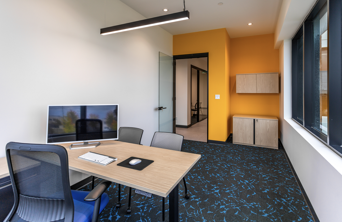
In Cowper’s office, furniture was selected around how the team works and collaborates, with different settings supporting different activities rather than forcing one furniture type across the entire workplace. Studio Forma
That’s how I’d approach it.
Lighting Can Become Part of the Brand
Edison Lighting Group gives us another useful example.
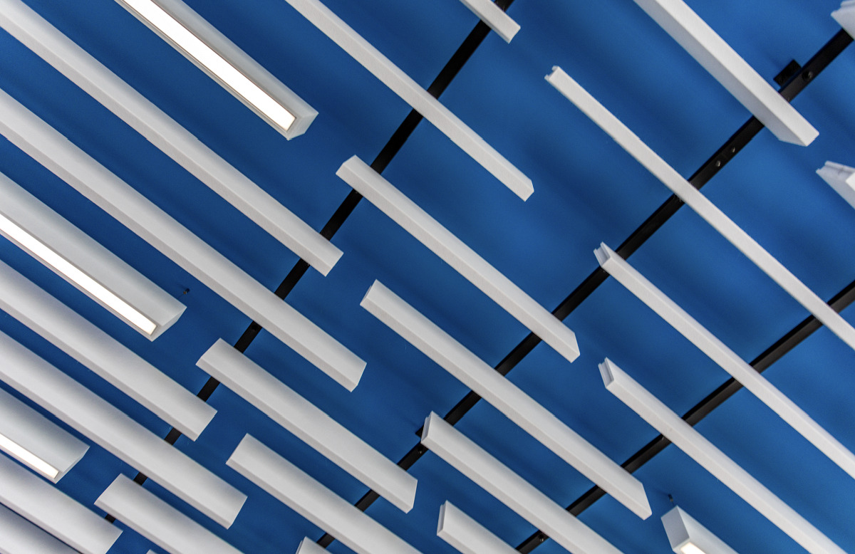
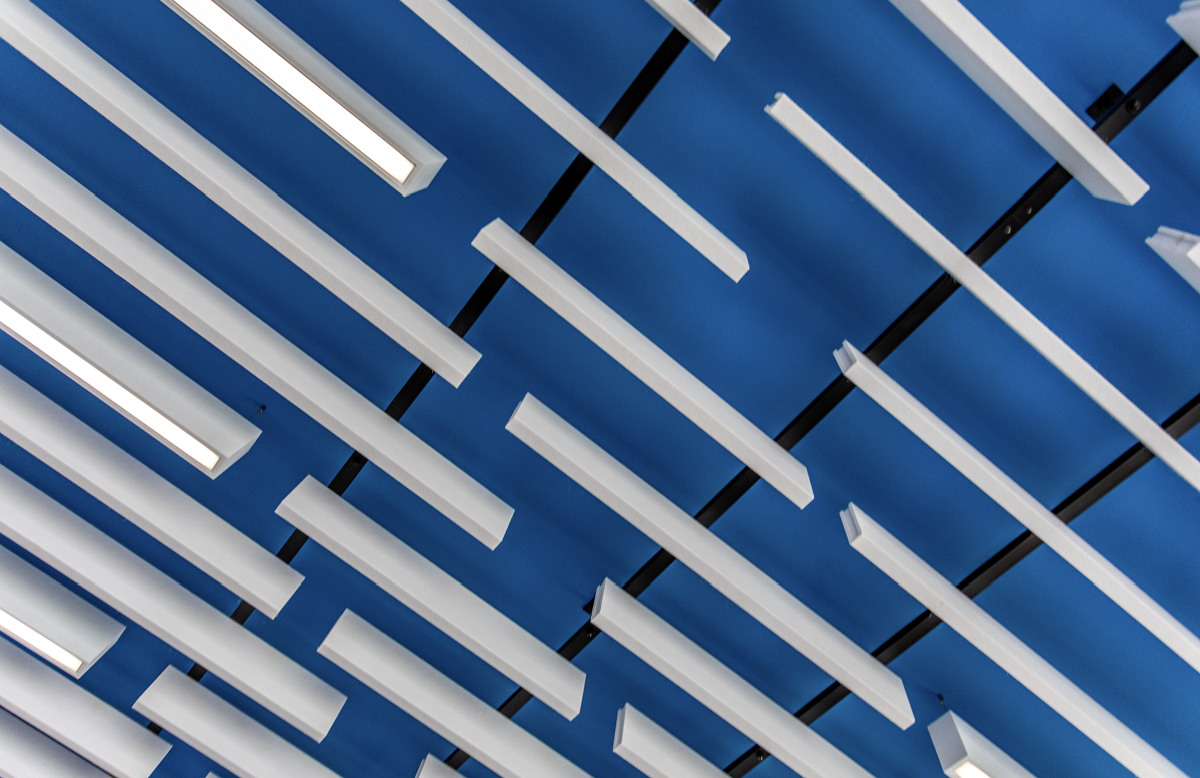
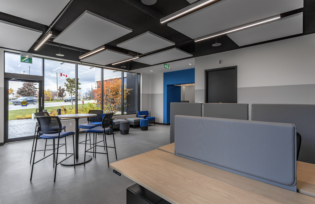
Their 4,500-square-foot Newmarket office needed to support rapid growth while also showcasing the company’s own lighting products. Studio Forma deliberately kept the surrounding palette restrained so the fixtures could become part of the office experience rather than competing with a visually busy interior. Studio Forma
That’s a very specific design strategy.
If the product is lighting, don’t design a ceiling that fights with it.
If the product is furniture, don’t fill the space with unrelated decorative furniture.
Let the thing the company actually does become the interesting part.
It sounds simple.
It isn’t always.
Office Design Needs to Work With the Sales Process
This is where interior designers should spend more time asking business questions.
How does the sales team host clients?
Do they demonstrate products before or after the formal meeting?
Does the technical team join partway through?
Are larger customer groups common?
Could the office support a product launch?
These questions help us determine whether the visitor path needs a dedicated sequence or whether a more informal approach fits the company better.
For businesses comparing office design in Canada, this is one of the places I’d look beyond a designer’s aesthetic portfolio.
Ask whether they understand how the business uses the space commercially.
Pretty offices are everywhere.
Useful ones are harder.
Don’t Ignore What Happens Behind the Product Display
Every display has a back side.
There may be wiring.
There may be storage.
There may be a wall that needs extra blocking because the product is heavy.
There might be power supplies that need ventilation.
The design build team needs to understand those requirements before construction.
If we’re mounting a substantial product to a partition wall, the contractor needs to know whether that wall requires reinforcement.
If integrated lighting is part of the display, the electrical rough-in needs to be coordinated before the wall is closed.
This is where office design stops being graphic design and becomes construction information.
Use Product Zones to Help Organize the Plan
Sometimes the client-facing experience can actually improve the office layout.
Let’s imagine a company that regularly runs demonstrations for customers.
Instead of putting that activity in the centre of the open office, we might create a client zone toward the front of the workplace.
Reception, demonstration, training, and the main meeting room can sit near one another.
Behind that, the everyday work areas remain more protected.
That’s useful because visitors aren’t wandering through every department.
It can also help with confidentiality.
The company gets its client experience without turning the entire office into a public zone.
Think About Noise Earlier Than You Think You Need To
Technical demonstrations can be noisy.
Training groups talk.
Products make sounds.
Doors open and close.
If those activities sit directly beside focused employees, people will notice.
No amount of decorative acoustic panels is going to fully correct a bad zoning decision.
So we start with location.
Can the demonstration area sit near a corridor or meeting zone instead of beside accounting?
Can storage create a buffer?
Would a properly constructed partition do more than adding surface treatments later?
This is office interior design at its most practical.
Solve the problem in the plan first.
Then use materials to refine it.
A Product-Led Office Still Needs Quiet Areas
One of the risks with energetic, client-facing workplaces is making every area feel active.
People still need somewhere to think.
A product company may thrive on collaboration, demonstrations, and visitors. That doesn’t mean every employee wants to work in that environment all day.
Private offices aren’t always the answer.
Focus rooms can help.
So can acoustic pods.
Sometimes the simple solution is keeping the visitor activity toward one end of the office and letting focused teams occupy the quieter side.
The exact solution changes.
The principle doesn’t.
Build the Office Around Change
Products change faster than buildings.
That’s worth remembering.
If a display system is too specific to one product generation, it could become obsolete surprisingly quickly.
I prefer designing the framework and letting the content change.
Adjustable shelves.
Replaceable panels.
Modular display elements.
Power and data capacity where future technology may need it.
You don’t have to predict the next ten years perfectly.
Just don’t make updating the office unnecessarily difficult.
Where Office Furniture and Millwork Should Separate
This is another area where experienced commercial interior design can save future headaches.
Not everything needs to be custom millwork.
If something is truly tied to the building, custom construction makes sense.
If it may move, grow, or change with the business, office furniture can be the smarter investment.
That distinction matters for storage, training areas, demonstration tables, and collaborative zones.
A custom piece may fit perfectly today.
A modular system may fit the business better five years from now.
A Simple Test We Use for Product-Led Office Design
Before approving a major feature, I like to ask what job it’s actually doing.
| Design Element | Questions Worth Asking |
|---|---|
| Product display | Does it explain something, or is it only decoration? |
| Reception feature | Does it strengthen the arrival experience without interfering with staff? |
| Training room | Can people actually see, hear, plug in, and move comfortably? |
| Custom millwork | Does it need to be permanent? |
| Furniture | Can it adapt as the team or product offering changes? |
| Brand feature | Would the space still feel like this company if the logo disappeared? |
| Client circulation | Can visitors reach key spaces without crossing sensitive work areas? |
| Demonstration zone | What does it need from power, structure, acoustics, and storage? |
That second-last question is one I think more offices should ask.
If the brand disappears the moment you remove the vinyl logo from reception, the interior probably isn’t doing enough.
Design Build Coordination Matters More in Experiential Offices
This kind of workplace often has more technical intersections than a standard office.
There may be custom displays.
Integrated lighting.
Equipment.
AV systems.
More detailed millwork.
The design build process needs to carry those requirements from concept into construction documentation.
That’s where things either become coordinated or become expensive questions on site.
A custom product feature can be beautiful in the rendering.
The contractor still needs dimensions.
The electrician still needs a location.
Someone still has to know how it’s attached to the wall.
We design both versions.
The one the client sees.
And the one somebody has to build.
Why This Is a Different Kind of Office Design
Most office design advice focuses on the people who work there.
That’s correct.
But for some companies, the workplace also plays a direct role in sales, training, recruiting, and customer education.
Cowper’s office is a good example. The environment supports employees while also giving visitors an immersive view into the company’s automation capabilities. Studio Forma
Edison Lighting’s office uses the company’s own products as part of the spatial experience. Studio Forma
These aren’t decorative decisions.
They’re business decisions translated into space.
That’s the kind of office design I find much more interesting.
Planning an Office for a Product-Led Business?
If your office needs to support clients as much as employees, don’t begin by asking where the logo goes.
Start with the visit.
Where does the client enter?
What do you want them to understand before the meeting starts?
What should they be able to see, touch, test, or experience?
Then protect the working office around that experience.
Studio Forma works across office design, office interior design, commercial interior design, office furniture, office renovation, and design build coordination for businesses in Toronto and the GTA.
My recommendation is fairly simple.
If your company makes something interesting, don’t hide it in a brochure.
But don’t let it take over the office either.
Design the space so the product earns its place.
Frequently Asked Questions (FAQ):
How can office design showcase a company's products?
Product-led office design can incorporate demonstration zones, integrated displays, training areas, custom architectural features, and strategic sightlines. The goal is to make the product part of the visitor experience without interfering with everyday workplace function.
Is product display the same as office branding?
Not exactly. Office branding can include colour, graphics, signage, and material choices. Product integration goes further by considering how clients physically experience or interact with what the company sells.
Should a showroom be separate from the office?
It depends on how frequently clients visit and how disruptive demonstrations are. Some companies benefit from a defined client-facing zone, while others can integrate selected product moments throughout the office.