A floor plan can look completely reasonable on a screen and still be wrong.
We’ve seen rooms that technically fit the furniture but become awkward the second someone pulls a chair out. Meeting spaces that look generous until you account for the camera, screen, credenza and circulation behind the chairs. Open offices where the workstation count works beautifully, but the people sitting there would spend half the day listening to video calls.
That’s why we don’t consider an office design finished simply because everything fits.
Before an office moves into detailed drawings and construction, we try to break the plan.
Not literally.
We look at the busiest day. The loudest activity. The employee carrying a laptop and coffee through the office while somebody else has their chair pushed back. We look at what happens when every meeting room is occupied, when two departments grow at different speeds, and when a client enters the office without anyone explaining where to go.
That’s the part of office interior design clients don’t always see.
And in my opinion, it’s where a lot of the real design work happens.
A Good Floor Plan Needs to Survive a Bad Day
Most plans look good under ideal conditions.
Twenty-seven employees are shown neatly seated at twenty-seven workstations. Chairs are pushed in. Nobody is standing in the corridor. The boardroom isn’t being used while three people wait outside for their next meeting.
Real offices aren’t that tidy.
So one of the first things we do is imagine the workplace under pressure.
What happens Tuesday at 10:30 a.m. when almost everyone is in?
Are there enough places for private calls? Does the kitchen become a bottleneck? Can someone walk behind occupied chairs without asking four people to move?
This kind of testing is especially valuable before an office renovation, because once construction starts, fixing circulation usually means moving something that already cost money to build.
I’d much rather find the problem while the wall is still a line in AutoCAD.
Test the Office by Activity, Not Just by Headcount
Headcount matters, but it’s a surprisingly incomplete way to design an office.
Two companies with 45 employees can require completely different workplaces.
One team may spend most of the day at individual workstations. Another may be constantly moving between project meetings and calls with people outside the office.
That difference changes the plan dramatically.
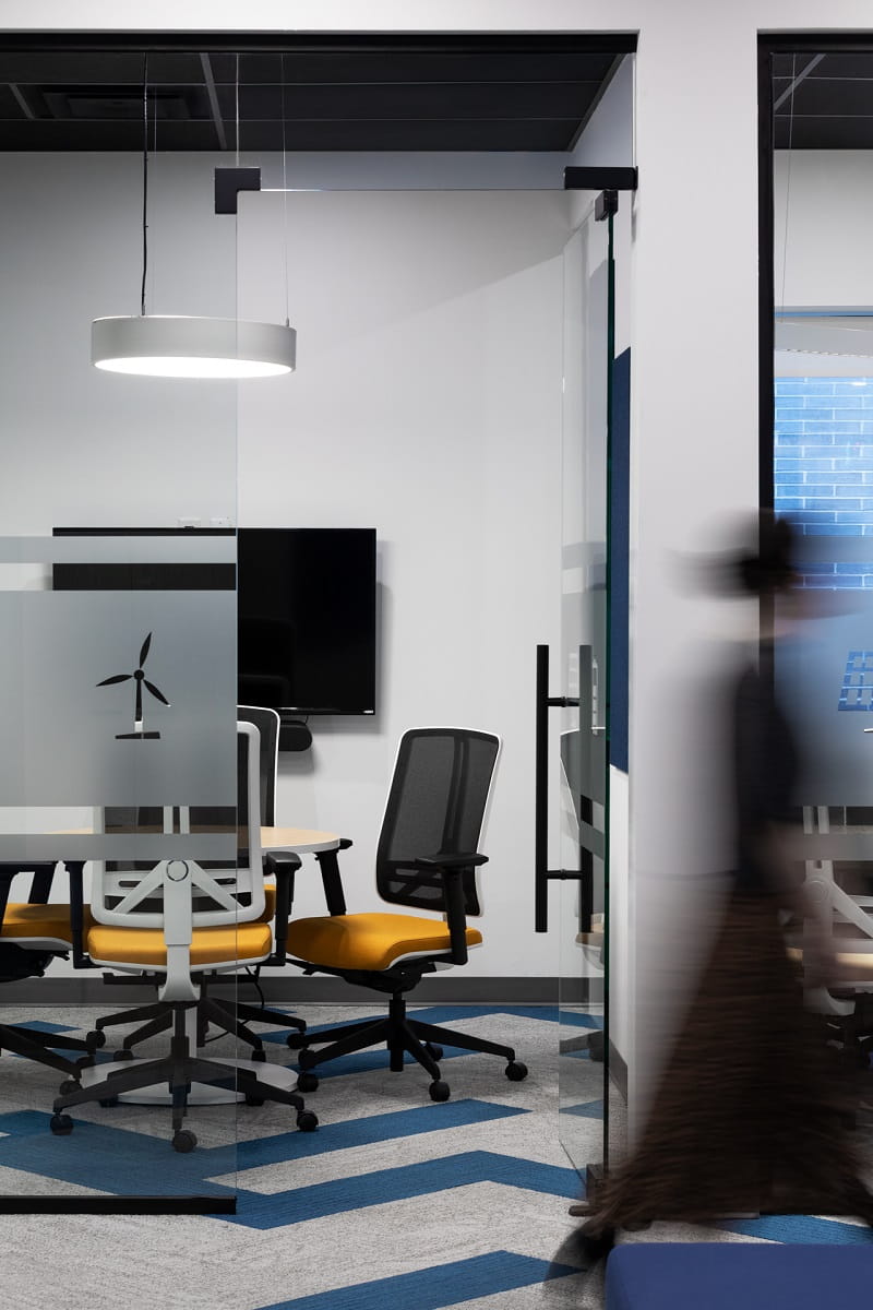
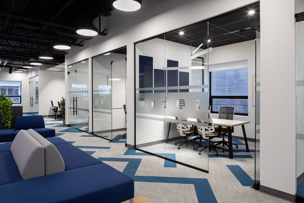
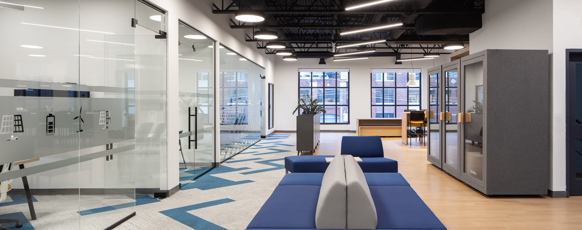
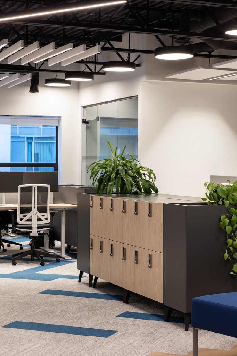
Studio Forma’s Neoen project is a good example. Neoen’s Toronto headquarters needed to function as a Canadian home base for a global renewable-energy company, with employees collaborating virtually across different time zones and international visitors coming through the office.
Simply giving everyone a desk wouldn’t have solved that.
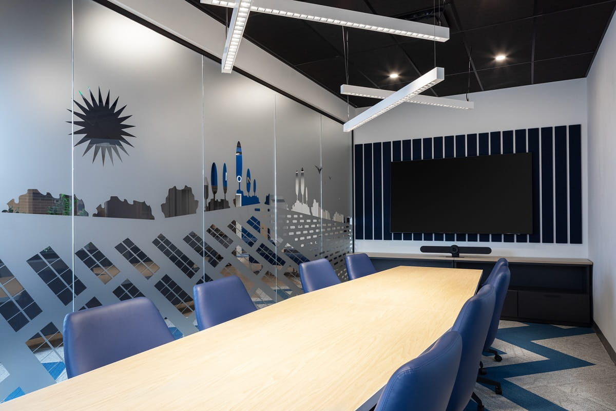
The office design needed several scales of communication space. Sound-isolated pods and small focus rooms handled individual virtual meetings, while larger rooms supported group collaboration.
That layered approach is something we use often.
Instead of asking, “How many meeting rooms do you want?” ask what people actually do in them.
A ten-person boardroom isn’t a substitute for a two-person call room.
We Check the Routes People Repeat All Day
One of the less glamorous things we do during commercial interior design is trace movement.
A lot.
The route from workstation to printer matters because someone may walk it fifteen times. The route between reception and the main meeting room matters because every client sees it. The path from the open office to the kitchen matters because it becomes much busier around lunch.
If those paths interfere with focused work, the office will feel more distracting than the plan suggests.
Here’s a simple example.
Imagine the only route to the kitchen cuts directly through a quiet workstation area. It may look perfectly acceptable when the plan is empty.
Then noon arrives.
Now twenty people are walking through that team’s work area carrying lunches and having conversations.
That’s not really an acoustic problem. It’s a planning problem.
The better fix is usually at the layout stage.
Look Behind the Chair
This sounds almost too simple to mention.
It isn’t.
We spend a surprising amount of time looking at what happens behind chairs.
A desk can fit perfectly against one wall while a storage cabinet fits perfectly against the opposite wall. That doesn’t mean the room works.
The person has to sit down.
They have to roll the chair backward. Someone may need to walk behind them. The cabinet doors still have to open.
If I have 36 inches on a drawing, I’m not automatically satisfied. I want to know what’s happening in that 36 inches.
Is it a circulation route?
Is there filing?
Does the employee regularly have visitors?
Sometimes 36 inches is plenty. Sometimes 42 feels tight.
Context matters more than the number.
This is where office furniture planning becomes part of the architecture instead of something we add after the walls have been decided.
Test the Sightlines Before You Choose the Finishes
Sightlines tell us what the office communicates.
Stand at the entrance, at least mentally.
What do you see?
Hopefully reception.
But perhaps the first thing visible is the back of a workstation, a printer area full of paper boxes, or a glass meeting room where someone is writing confidential notes on a whiteboard.
Those are very different first impressions.
We do the same exercise from inside meeting rooms and private offices.
What does someone see through the glass?
What appears behind an employee during a video call?
Does a major brand feature appear naturally in the view, or is the strongest design moment hidden somewhere nobody walks?
This was important at Neoen because the office had to support both local staff and international interaction. It wasn’t enough for the workplace to photograph well. Spaces needed to function on camera and in person.
That distinction is becoming much more relevant in office design Canada, particularly for organizations whose teams regularly work across cities or countries.
Treat Video Calls Like a Room Type
We used to design “meeting rooms.”
Now we design several different kinds of communication spaces.
That change sounds subtle, but it affects almost everything.
A room primarily used for video conferencing needs to be considered from the camera position first. The lighting can’t create an unpleasant silhouette. People shouldn’t have a busy circulation route visible through the glass behind them.
Acoustics matter too.
And here’s where it gets tricky. A small room designed for one person often needs more acoustic attention than clients expect because that person is speaking continuously while sitting close to hard surfaces.
At Neoen, the solution wasn’t one universal meeting-room type. Studio Forma incorporated sound-isolated pods, smaller focus spaces and larger meeting environments to support different kinds of global collaboration.
That’s a strategy I strongly prefer.
Different conversations need different rooms.
We Stress-Test Acoustics Before Choosing Acoustic Products
Clients sometimes ask us which acoustic panel they should buy before we’ve discussed what’s causing the noise.
That’s backwards.
Acoustic products can help, but the first question should be whether incompatible activities are sitting beside each other.
A high-energy collaboration area directly beside focused workstations will always require more intervention than one positioned intelligently from the start.
Start with zoning.
Then look at enclosure.
Then materials.
This order matters because adding acoustic panels later won’t completely rescue a poorly planned relationship between spaces.
In an open office, we might deliberately place storage or circulation between a noisy collaborative zone and focused workstations. Sometimes a meeting room itself becomes a buffer.
That’s office interior design doing acoustic work before we’ve specified a single panel.
Don’t Waste the Best Real Estate on the Wrong Room
Windows are premium office real estate.
I get nervous when a plan gives every perimeter window to rooms that sit empty most of the day.
There are exceptions. Executive privacy, confidential work and existing building constraints can justify it.
But we should at least question it.
If a boardroom is occupied for nine hours a week while twenty employees sit away from daylight for forty hours each, that allocation deserves another look.
Glass fronts can help borrow light. So can careful room placement.
The goal isn’t to eliminate private offices.
It’s to make the natural light work harder.
Test the Furniture Against Power Before the Electrical Drawings Are Finished
One of the least exciting things we can prevent is also one of the most irritating to fix.
An outlet in the wrong place.
Workstations often look deceptively simple. Then the actual furniture system arrives and we discover that a frame, modesty panel or storage unit is exactly where someone expected the power connection to be.
This is why the furniture plan should develop alongside electrical coordination.
Not afterward.
With systems from manufacturers such as Groupe Lacasse or Artopex, we can understand the actual dimensions of panels, worksurfaces and storage components before construction is complete.
That allows the electrical plan to respond to the office furniture, rather than asking the furniture installer to somehow work around construction decisions made months earlier.
We Check Whether Flexible Space Is Actually Flexible
Calling a room “multi-purpose” doesn’t make it one.
The furniture has to move.
There needs to be somewhere for it to go.
Power can’t depend on one exact table position. The screen needs to remain visible in more than one configuration.
And heavy furniture changes the conversation quickly.
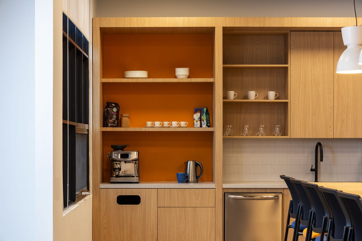
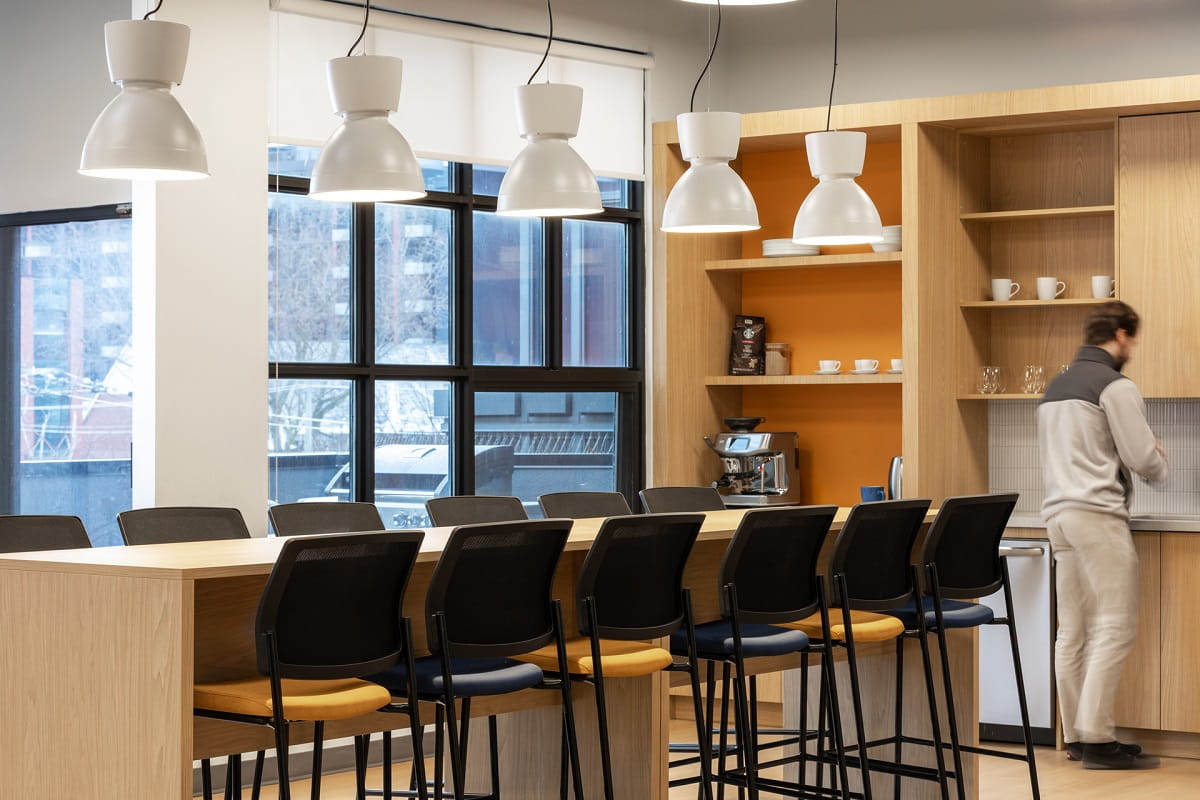
Neoen’s workplace used movable soft seating and a generous communal kitchen area so the same portions of the office could support informal interaction and different group configurations.
That’s genuine flexibility.
If reconfiguring a room requires four employees and a furniture dolly, I wouldn’t call it flexible.
Then We Look Up
This is usually where a beautiful floor plan starts arguing with reality.
The ceiling contains lighting, diffusers, sprinklers and fire alarm devices. Depending on the building, there may also be structural elements or exposed mechanical systems.
Move a wall and you affect that ceiling.
Place a meeting table and now the decorative fixture needs to align with it.
Shift the table 14 inches because the furniture changed, and suddenly the lighting layout may need another look.
That’s why commercial construction considerations enter the design long before the contractor is physically on site.
A good design build process catches those relationships while they’re still relatively inexpensive to resolve.
Our Designers’ Pre-Construction Stress Test
We don’t literally use one universal checklist for every project, because offices aren’t universal.
But the questions are fairly consistent.
What We Test | What We’re Looking For |
Busiest-day occupancy | Whether the office still feels usable when attendance peaks |
Circulation | Repeated paths that interrupt work or create bottlenecks |
Furniture in use | Chair movement, drawer access and realistic clearances |
Meeting demand | Whether room sizes match actual types of conversations |
Acoustics | Conflicting activities located too close together |
Sightlines | What clients, staff and cameras actually see |
Natural light | Whether valuable daylight is being used intelligently |
Power and data | Whether services align with real furniture |
Ceiling coordination | Conflicts between design and building systems |
Future changes | Which parts of the plan can change without another renovation |
That last row matters more than people think.
Don’t Design Every Inch Too Perfectly
This is another opinion I’ve developed after working on commercial spaces for years.
Sometimes a plan can be too optimized.
Every wall lines up with one exact furniture configuration. Every workstation fits within half an inch. Every room has one specific purpose.
It looks excellent at sign-off.
Then the company changes.
A six-person department becomes eight. A room that was intended for storage suddenly needs to become a focus room.
Now there’s no give.
I’d rather leave a little tolerance in the plan. Not wasted space, just enough flexibility that the workplace isn’t dependent on every assumption remaining true forever.
Neoen’s 6,200 sq. ft. Toronto headquarters was specifically planned around adaptability, with multi-purpose spaces and movable seating so the workplace could respond to different activities over time.
That’s a much smarter form of future planning than simply leaving an empty room “for growth.”
Where the Commercial Construction Team Comes In
Eventually, the stress-tested plan has to become a real building.
That’s where design decisions meet the commercial construction team.
The drawings need to explain enough that the contractor isn’t guessing what the designer meant. The ceiling needs to agree with the floor plan. Millwork needs actual dimensions.
A commercial general contractor can also identify site conditions or sequencing issues that affect how certain elements are built.
That relationship works best when construction feedback is treated as information rather than as a threat to the design.
There are usually several ways to solve a detail.
The job is finding the one that protects what matters most.
The Best Office Design Problems Are the Ones the Client Never Sees
A client walking into the finished workplace may never know that we shifted a wall 5 inches because a chair clearance wasn’t comfortable.
They probably won’t notice that a workstation moved slightly so the electrical feed made more sense.
They shouldn’t.
That’s the point.
Strong commercial interior design often disappears into daily use. Doors open where you expect them to. People can move without squeezing behind chairs. Calls happen without disrupting forty other employees.
Nothing feels remarkable.
It just works.
Planning an Office Design or Renovation?
If you’re reviewing an office plan, don’t ask only whether everything fits.
Ask what happens when everything is being used at once.
Walk the routes your employees will walk. Pull the chairs back. Open the cabinets. Imagine every meeting room occupied. Look through the glass from both directions.
Then look up.
Studio Forma works across office design, office interior design, office furniture, construction documentation and design build coordination for commercial workplaces in Toronto and the GTA.
If I had to give a client one piece of advice before approving a layout, it would be this:
Don’t approve the floor plan while it’s empty.
Approve it after you’ve mentally filled it with people.
Frequently Asked Questions (FAQ):
What is office design?
Office design is the planning of a workplace around the people, activities, brand, and physical requirements of the business. It can include space planning, office interior design, furniture, lighting, finishes, technical coordination, and construction documentation.
What is the difference between office design and office interior design?
The terms overlap significantly. Office design can refer broadly to the planning of the workplace, while office interior design typically includes the detailed development of the interior environment, from layouts and materials to construction requirements and furniture coordination.
Does improving an office design require a full renovation?
No. Some workplaces can be significantly improved through targeted layout changes, furniture, lighting, finishes, storage, or brand integration without extensive demolition. The right scope depends on what’s already working.