There’s a point in almost every office project where a client asks us some version of the same question.
“Do we really need to change all of this?”
Usually, no.
Good office design isn’t about demolishing everything just because you have the opportunity. In fact, I’d argue that one of the better tests of an experienced designer is knowing what not to change.
Sometimes the shell already works. The windows are in the right places. The private offices are generally where they should be. Plumbing is expensive to relocate and doesn’t need to move. What isn’t working might be the circulation, departmental relationships, furniture, lighting, or the way the company is represented when someone walks through the door.
That’s a very different design problem.
For businesses considering an office renovation, the smartest starting point isn’t “What can we replace?” It’s “What is already working well enough to keep?”
That question can save a surprising amount of construction.
Start With How the Business Works, Not With the Existing Floor Plan
The existing office is useful information, but I don’t like treating it as the brief.
We start with the business.
Who needs to sit near whom? Which departments are constantly crossing the office to speak to each other? Who spends most of the day in focused work? Where do clients go, and what do they see along the way?
Those answers tell us far more than the current furniture arrangement does.
This is one of the lessons that came through clearly in our work with Commport. Studio Forma had originally designed the same workplace years earlier for Solutions 360. When Commport later moved into the space, we weren’t dealing with a bad office. We were dealing with an office designed around somebody else’s organization. Same shell. Different company.
That changes everything.
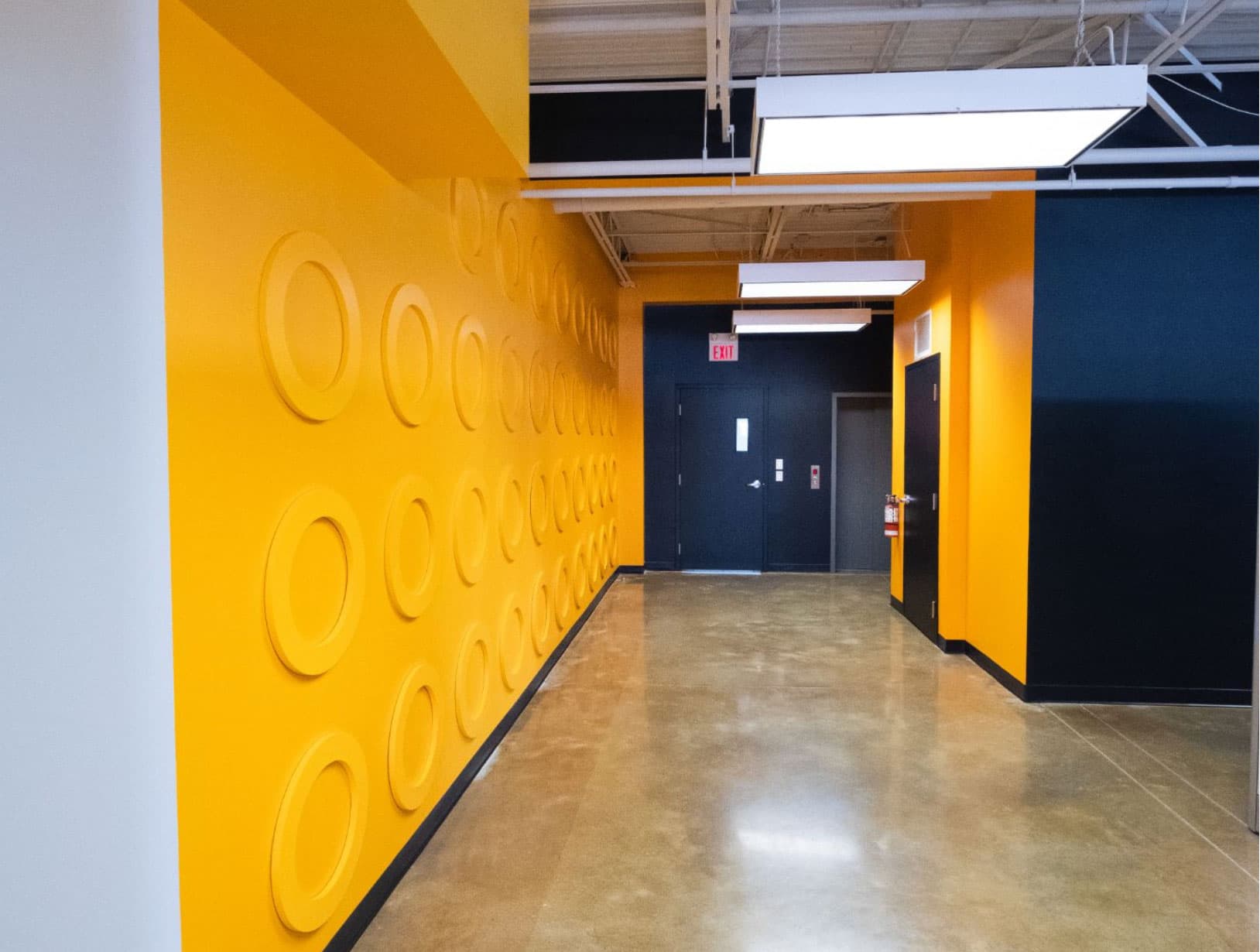
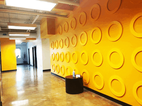
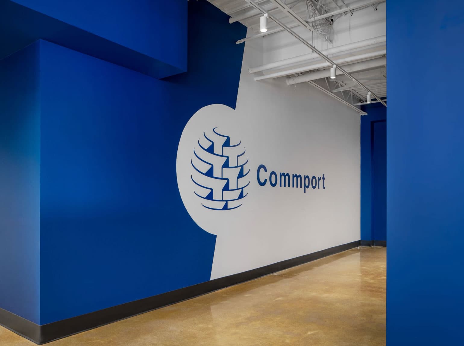
The attached Commport project article describes the new workplace as being reshaped around circulation, departmental adjacencies, brand identity, and the way Commport actually operated rather than through extensive demolition.That is the kind of office interior design strategy I think businesses should be looking for.
Don’t Demolish a Good Layout Just Because It’s Old
There is a tendency during commercial remodeling to assume that a dramatic transformation requires dramatic demolition.
It doesn’t.
Sometimes the most valuable thing we can do is leave 70 percent of a layout alone and spend our effort fixing the 30 percent that causes problems every day.
Maybe a reception wall is blocking the natural arrival path. Maybe an enclosed office near the entrance would work better as a client meeting room. Or two departments that communicate constantly are separated because of a layout decision made for the previous tenant.
Those are strategic changes.
Compare that with removing every partition simply because a completely open office looks cleaner on an early rendering.
I’d rather work harder on the plan.
Walls cost money to remove and money to rebuild. They also affect electrical, ceilings, mechanical systems, flooring, fire protection, and potentially the building permit. Once the commercial general contractor becomes involved, that one line on the plan isn’t one line anymore.
Look at Adjacencies Before You Look at Aesthetics
One of the most useful exercises in commercial interior design is surprisingly unglamorous.
We look at who needs to be near whom.
You can think of the office almost like a small city. Some areas need constant interaction. Others need separation. Certain spaces are destinations that everyone uses, while others should remain quiet and relatively private.
If accounting employees walk past twenty workstations every time they need the printer they use all day, we have a planning issue.
If visitors cross directly through a focused work area to reach the boardroom, same thing.
And if six people regularly gather beside someone’s desk because that’s the only convenient place for a quick conversation, the plan is telling us something.
Those little observations matter because office design is repetitive. A circulation problem doesn’t happen once. Employees experience it five days a week.
That’s where good planning earns its keep.
Protect Natural Light Before You Start Adding Rooms
This is one of my stronger design opinions.
Natural light is too valuable to waste behind spaces that don’t need it.
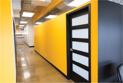
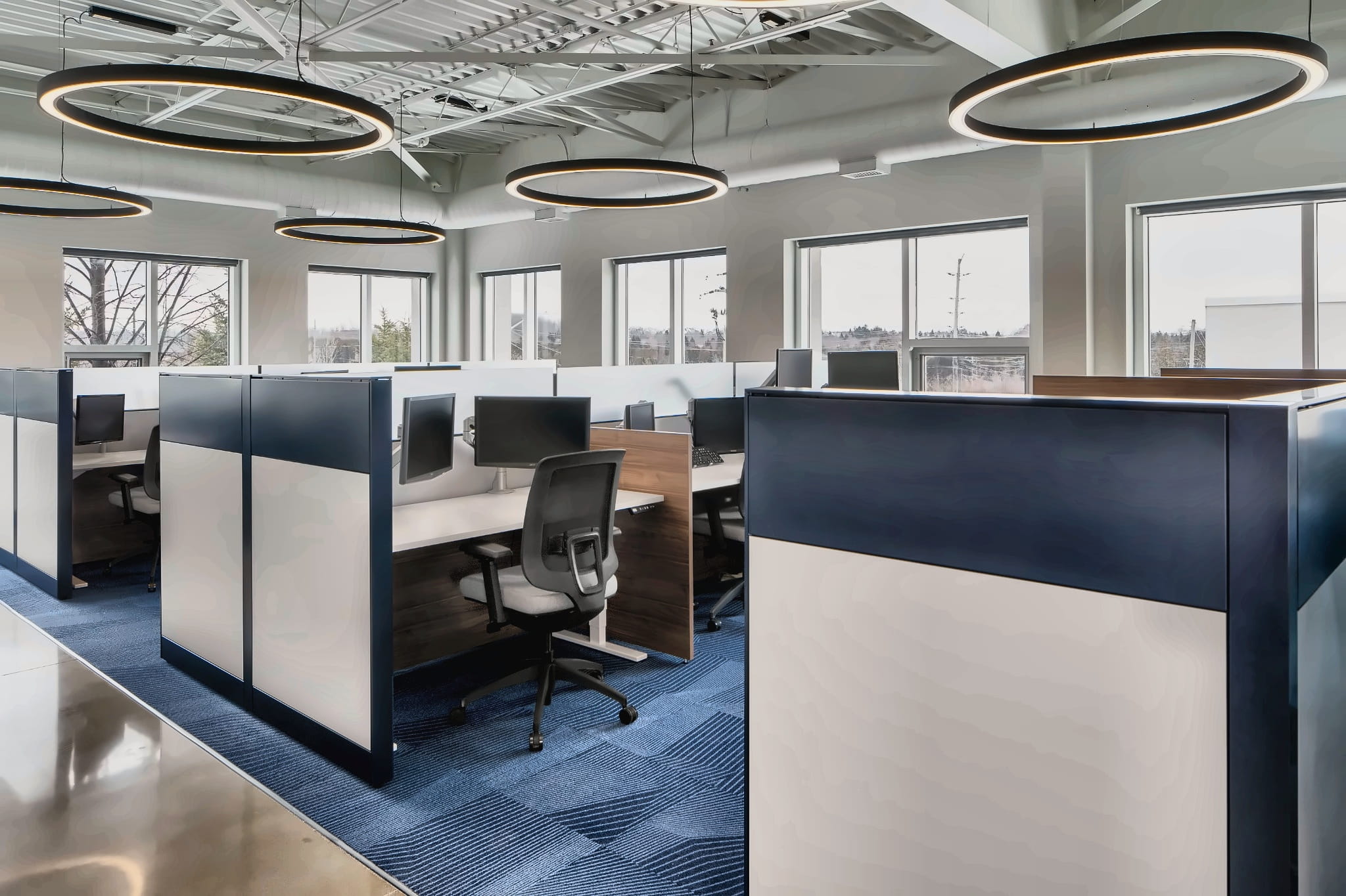
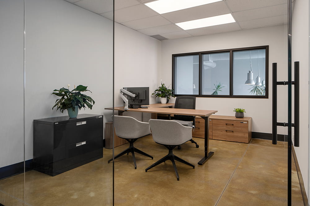
In the Commport office, glass-fronted private offices were positioned around the perimeter so light could continue travelling into the workplace rather than being stopped by opaque walls. The private offices still had definition, while the broader office remained visually connected. The project material also notes that height-adjustable desks, ergonomic seating, integrated storage, and open workstations were used alongside that planning strategy.
That combination matters.
If we’re developing an office interior design and every private office takes a window with a solid wall behind it, the centre of the workplace can become much darker than it needs to be.
Sometimes privacy wins. Of course.
But it should be a conscious trade-off.
Glass fronts, borrowed light, partial-height elements, furniture placement, and careful room positioning can usually do more than people expect.
Brand Integration Should Change How the Space Feels
Putting a logo behind reception is branding.
It isn’t necessarily brand integration.
The more interesting question is how the company should feel when you walk through the office.
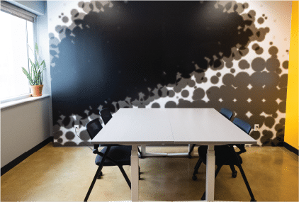
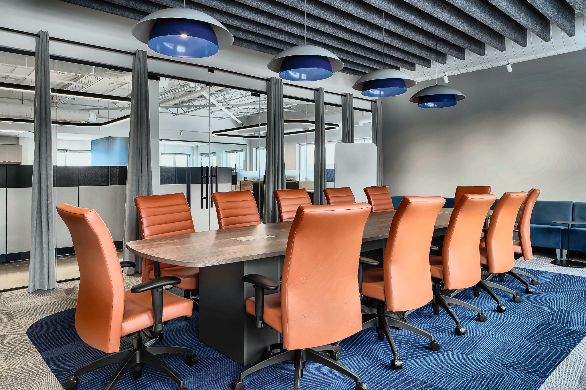
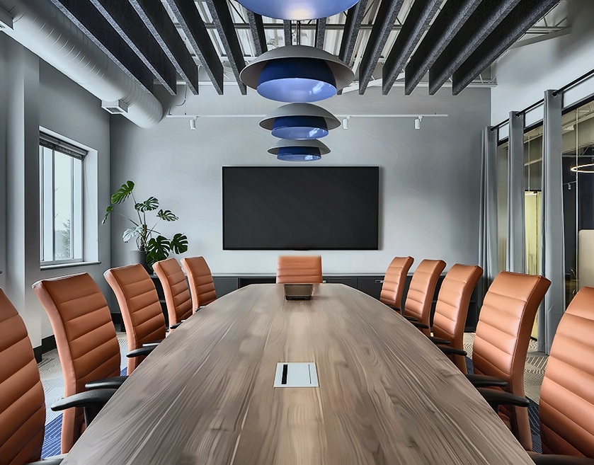
Commport is a good example because the brand wasn’t applied as a collection of graphics after the design was finished. A deep blue became part of the architecture, then appeared against warm wood, white surfaces, and polished concrete. The boardroom went in a different direction. It used a substantial wood table with high-backed burnt orange seating, along with overhead lighting and acoustic ceiling elements. That room didn’t need another blue wall to prove it belonged to Commport.
This is an area where office design Canada searches can become a little generic. You see a lot of advice about adding your corporate colours to walls.
I’d go further.
A brand can influence how formal the reception feels, how much transparency you use, how expressive the furniture becomes, whether materials feel polished or tactile, and how much visual energy is appropriate.
Colour is one tool.
Not the strategy.
Use Furniture to Solve Planning Problems Before You Build More Walls
One of the easiest ways to make an office renovation more expensive is using construction to solve something furniture could have solved.
Suppose we need some separation between a team of workstations and a circulation path.
We could build a wall.
Or we might use storage, acoustic screens, planters, a change in furniture orientation, or a combination of those things.
The right choice depends on acoustics and privacy requirements, but construction shouldn’t automatically be the answer.
Office furniture has become far more architectural than it used to be. Workstation systems can define zones. Storage can create boundaries. Acoustic panels can provide visual separation while helping with sound.
And furniture can move later.
That’s valuable.
We’ve worked with commercial manufacturers where a workstation system can be reconfigured as a company changes. I like that flexibility because the office you design today probably won’t be used exactly the same way seven years from now.
Design for What Happens Around the Furniture
A floor plan can lie to you.
Not intentionally, obviously. But a desk represented as a clean rectangle doesn’t show the chair pulled out, somebody walking behind it, the filing drawer open, or a visitor standing beside the employee asking a question.
That’s why dimensions have to be considered in use.
Imagine a private office where the drawing leaves 37 inches between the back of the desk chair and a storage cabinet. Technically, you can probably make the pieces fit.
Then the employee rolls their chair back and somebody opens the cabinet.
Now it’s irritating.
I’d rather shorten the cabinet.
Those few inches don’t photograph differently, but the employee feels them every day.
That’s the kind of office interior design detail that matters more to me than whether every wall looks perfectly symmetrical in plan.
The Ceiling Plan Usually Tells You Whether the Design Is Really Coordinated
Clients naturally spend more time looking at floor plans.
Designers spend a lot of time looking up.
Once partitions change, the reflected ceiling plan becomes a very useful reality check. Lighting needs to make sense with the new rooms. HVAC diffusers can’t simply disappear above a new wall. Sprinklers, fire alarm devices, acoustic elements, ceiling grids, and bulkheads all start interacting.
This is where commercial construction begins influencing the design even though we may still be in the design phase.
A beautifully centred pendant over a boardroom table doesn’t help if the existing mechanical duct is occupying exactly the same space above the ceiling.
We’d rather discover that now.
Later, the commercial contractor will coordinate how it gets built, but the design team needs to anticipate the conflict before the drawings reach site.
Don’t Let the Furniture Plan Arrive After the Electrical Plan
This happens more often than it should.
Power gets designed.
Then furniture is finalized.
Then everyone realizes the workstation spine is 14 inches away from the floor box.
Can it be fixed? Probably.
But this is precisely the kind of avoidable issue that makes commercial projects feel harder than they need to be.
Furniture planning should happen early enough that electrical and data locations can respond to the actual layout.
The same applies to private offices.
If the desk return changes sides, power may change sides too. A television in a meeting room affects power, data, wall backing, and sometimes the room orientation itself.
Design decisions don’t stay inside neat categories.
They overlap.
Think About the Office as a Series of Experiences
We don’t experience an office from the ceiling plan.
We experience it walking.
That sounds obvious, but it’s incredibly useful during design.
Start at the front door.
What do you see first?
Where do you naturally move?
Can a visitor understand where reception is without being told?
From reception, what’s visible that perhaps shouldn’t be? A messy printer station? Employee coats? The back of a workstation?
Now walk toward the boardroom.
Then imagine the route an employee takes between their workstation, kitchen, printer, and washroom.
Those paths tell you a lot.
In Commport’s case, the café was positioned as a social area with natural light and flexible seating rather than being treated purely as a back-of-house kitchen.
That changes how the workplace behaves.
A kitchen can be somewhere employees heat lunch.
Or it can become the place where informal interaction actually happens.
Same room type. Very different design intent.
Know Which Changes Belong to Design and Which Belong to Construction
This is where experienced commercial interior design starts protecting the project budget.
Consider three changes:
Changing an accent wall colour.
Moving a workstation.
Moving a plumbing fixture six feet.
All three might look relatively simple on a drawing.
They aren’t remotely equal during commercial construction.
The colour is easy.
The workstation might affect electrical locations.
The plumbing fixture could involve demolition, drains, slab work, permits, and coordination with the commercial general contractor.
So when we’re developing the design, we don’t evaluate choices only on whether they look better.
We ask what they trigger.
That is particularly important in existing offices, where the building may already be giving us perfectly workable infrastructure.
If we can achieve the design objective without moving it, I’m usually interested.
A Practical Office Design Decision Test
This is roughly how I like to pressure-test major design decisions before they become construction decisions.
Question | Why We Ask It |
Does this improve how people actually work? | If not, we may be spending money on appearance alone |
Does it improve circulation or adjacency? | Repeated daily movement has a real effect on the workplace |
Are we protecting useful existing conditions? | Keeping good infrastructure can control renovation scope |
What else does this decision affect? | Walls, ceilings, furniture and building systems overlap |
Can furniture solve it instead of construction? | Flexible solutions can reduce permanent work |
Will this still make sense if the company grows? | Offices change faster than buildings |
Is it worth the construction cost? | Some visually small changes carry disproportionate cost |
That last question gets asked a lot.
And it should.
Office Design Should Give the Commercial General Contractor Fewer Things to Guess
By the time a project reaches tendering, the design shouldn’t still depend heavily on interpretation.
The commercial general contractor needs to understand what is being removed and what is being built. Major finish transitions should be resolved. Furniture needs to be coordinated enough to understand electrical requirements.
If important decisions are missing, someone will make an assumption.
Maybe it’s the estimator. Maybe it’s a trade. Maybe it’s someone on site because construction can’t stop while everybody waits for an answer.
Good design documentation reduces those moments.
Not entirely. Renovations will always surprise you.
But enough to matter.
This is why our Office Interior Design and Commercial Design & Build work overlap. Studio Forma’s current process connects concept and space planning with documentation, permits, design development, construction coordination, and post-occupancy review rather than treating the design as something that simply gets handed off once the drawings look finished.
A Better Office Doesn’t Necessarily Mean a Bigger Renovation
This may be the most useful lesson from the Commport project.
The physical footprint had already housed another company and had already been designed once by Studio Forma. Commport didn’t need a completely different building to get a workplace that felt specific to them.
The transformation came from understanding the new company.
Circulation was refined. Department relationships were reconsidered. Brand elements changed. Furniture and storage supported the way Commport worked. The material palette gave the office a completely different identity. That’s good office design to me.
Not changing everything.
Changing the right things.
Planning an Office Design or Office Renovation?
If you’re evaluating an existing workplace, I’d start by resisting the urge to immediately create a demolition plan.
Spend some time understanding what the current space already does well.
Keep the useful parts. Fix the circulation problems. Look closely at departmental relationships and natural light before deciding where new rooms belong. Coordinate office furniture while the design is still flexible, then make sure construction documentation gives the contractor enough information to carry those decisions into the finished space.
Studio Forma works across office design, commercial interior design, office renovation, construction documentation, contractor coordination, and furniture procurement for businesses in Toronto and across the GTA.
And if I had to give one recommendation before a client starts a commercial remodeling project, it would be this:
Don’t measure the quality of the redesign by how much you demolished.
Measure it by how much better the office works afterward.
Frequently Asked Questions (FAQ):
What is office design?
Office design is the planning of a workplace around the people, activities, brand, and physical requirements of the business. It can include space planning, office interior design, furniture, lighting, finishes, technical coordination, and construction documentation.
What is the difference between office design and office interior design?
The terms overlap significantly. Office design can refer broadly to the planning of the workplace, while office interior design typically includes the detailed development of the interior environment, from layouts and materials to construction requirements and furniture coordination.
Does improving an office design require a full renovation?
No. Some workplaces can be significantly improved through targeted layout changes, furniture, lighting, finishes, storage, or brand integration without extensive demolition. The right scope depends on what’s already working.