

Walking into a clinic should feel straightforward.
You should know where to check in. The receptionist shouldn’t have to point every second patient toward the washroom. People waiting for an appointment shouldn’t be sitting directly in front of a treatment-room door. Staff shouldn’t have to cross the public waiting area every time they need supplies.
Those things sound small.
They aren’t.
Good clinic interior design starts long before we choose the wall colour or waiting-room chairs. We’re looking at how patients move through the space, what staff need during a typical day, where privacy matters, and which parts of the clinic will take the most wear.
Healthcare spaces also have another layer that most commercial interiors don’t.
Accessibility, Building Code requirements, infection prevention, clinical equipment and cleaning all influence the design.
That’s why I don’t like thinking about clinics as offices with examination rooms added to them.
They’re their own design problem.

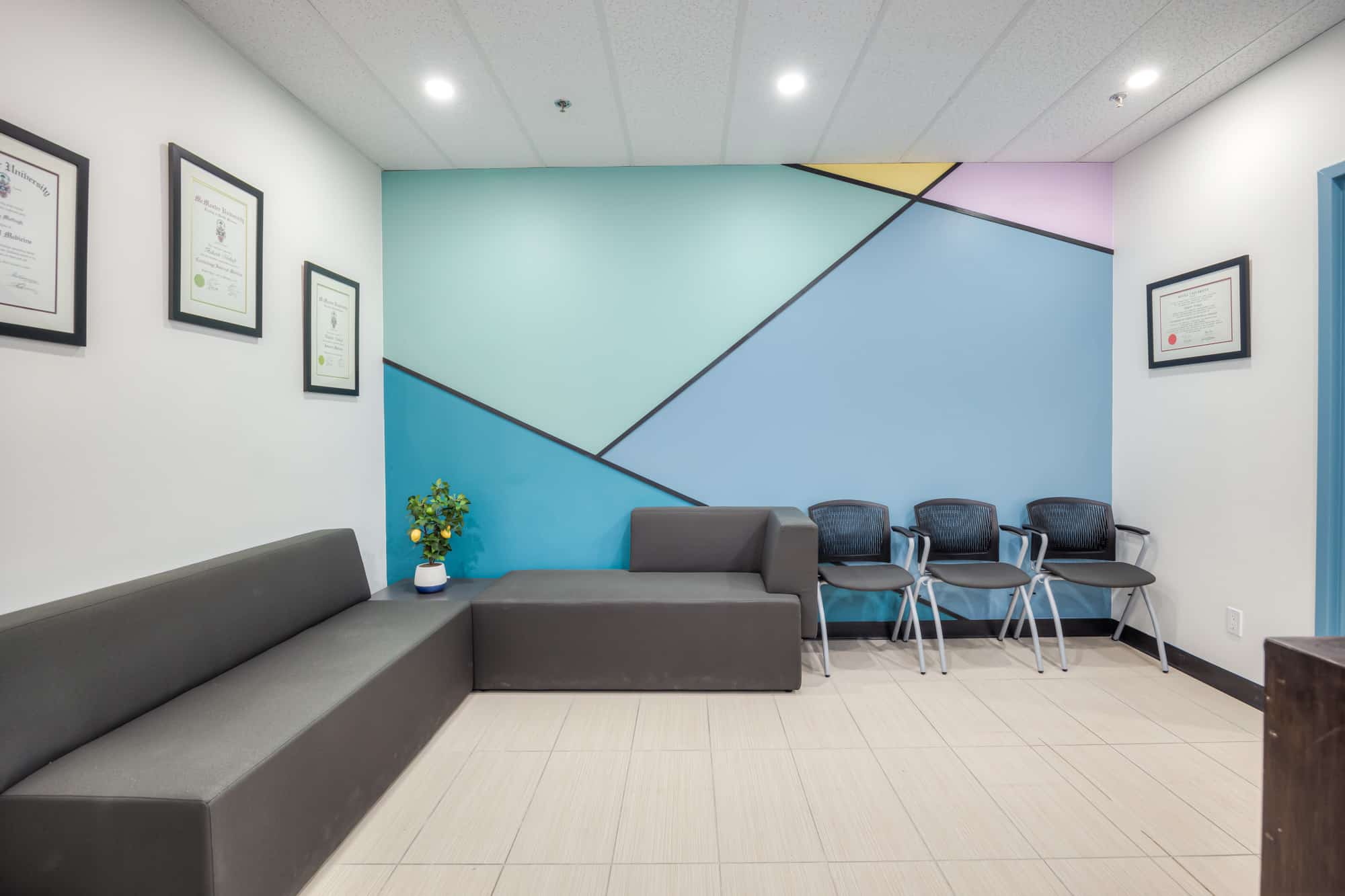


Start With the Patient Journey Before You Start Drawing Rooms
One of the first things we’ll do on a clinic project is follow the patient experience from the front door.
Not metaphorically. We actually work through the sequence.
A patient enters. Where do they go first?
Can they identify reception immediately, or are they standing in the entrance looking around?
Once they’re checked in, how do they reach the waiting area? How are they called into treatment? After the appointment, do they exit through the same space, or does that create unnecessary crossing with arriving patients?
Those movements begin shaping the floor plan.
A clinic with five examination rooms isn’t simply a puzzle where we fit five rectangles into the available square footage.
We’re also thinking about the distance between reception and treatment areas, staff travel, clean and used supplies, patient privacy, washroom access, and whether somebody using a mobility device can move comfortably through the same route.
That’s where healthcare design becomes operational.
Don’t Make Patients Ask Where Everything Is
Good wayfinding shouldn’t rely entirely on signs.
Signs help, of course.
But the architecture should be doing some of the work.
If patients leave reception and face three identical corridors, we’ve probably created unnecessary confusion. Colour, lighting, sightlines and the position of major destinations can help people understand where to go.
Sometimes the solution is extremely simple.
A reception desk angled slightly toward the entrance can make the arrival much clearer than a desk positioned parallel to the wall.
A change in flooring or ceiling treatment can identify a main circulation route.
And in larger healthcare facilities, visual landmarks can become much more useful than adding another arrow to the wall.
The goal isn’t to turn the clinic into an airport.
It’s to reduce moments where patients have to stop and wonder.
Patient Flow and Staff Flow Are Related, But They’re Not the Same
This is where clinic planning gets interesting.
Patients and employees often need access to the same rooms, but they don’t necessarily need to move through the clinic in the same way.
For example, a patient may move from reception to waiting, then into an exam or treatment room.
Staff may be moving between workstations, treatment rooms, storage, clean supplies and administrative areas repeatedly throughout the day.
If both circulation patterns are forced through one narrow corridor, the clinic can feel much busier than it really is.
We try to identify those conflicts during planning.
A few extra feet of travel for a patient who walks that route once may be completely reasonable if it saves a nurse or technician from walking the same unnecessary distance forty times in a shift.
That’s the kind of decision you don’t see in a finished photograph.
But staff feel it.
Every day.
Accessibility Needs to Be Designed Into the Layout
Accessibility is not something we should be checking at the end of the project.
In Ontario, the Building Code includes requirements for barrier-free paths of travel, turning spaces, entrances, doorway and corridor widths, power door operators, and accessible washrooms in applicable new construction and extensive renovations.
Those requirements affect the floor plan from the beginning.
A washroom might technically fit in an available corner, but does the layout provide the required manoeuvring space?
Can somebody using a wheelchair approach reception without furniture narrowing the path?
Does a door swing create a conflict in a busy corridor?
I also think it’s worth looking beyond the minimum dimensions.
A technically accessible waiting room can still be awkward if every wheelchair position feels like it was added after the furniture plan was finished.
It shouldn’t.
Accessible seating and circulation should feel like part of the room.
Case Study: Turning a Century Home Into Hope Medical Clinic
Hope Medical Clinic in Sharon is a good example of why healthcare interior design requires more than applying a clinical finish palette.
The project involved transforming a century home into a 4,500-square-foot medical clinic.
That’s a very different starting point from an empty commercial unit.
The existing structure had residential proportions and conditions, but the finished space needed to function as a modern healthcare environment.
Studio Forma reconfigured the layout to address barrier-free access, fire separation, ventilation and clinical workflow while retaining a warmer character that suited the existing building.
That’s the part of adaptive reuse I find most interesting.
You don’t automatically remove every trace of the old building.
You decide which qualities are useful and which conditions prevent the new program from working.
At Hope Medical Clinic, durable antimicrobial materials, quartz surfaces, sealed millwork and resilient flooring were incorporated alongside softer wood tones and restrained finishes.
The result didn’t need to feel institutional simply because it had to perform like a healthcare space.
That’s an important distinction.
Durability Means More Than Choosing a Commercial-Grade Product
Healthcare materials get cleaned a lot.
That changes how we look at finishes.
A material can be technically durable and still be a poor choice if its seams collect dirt, its texture is difficult to disinfect, or the finish starts looking worn after repeated cleaning.
Public Health Ontario’s guidance emphasizes routine and effective cleaning and disinfection of environmental surfaces as a core part of infection prevention in healthcare environments.
So we ask different questions than we might in a corporate office.
Can the surface tolerate the cleaning products the clinic uses?
What’s happening at the edge of the countertop?
Does the millwork have joints or exposed materials that are difficult to maintain?
Is the upholstery appropriate for a high-turnover patient area?
And here’s the thing. You can still make those materials look good.
For healthcare projects in Studio Forma’s portfolio, you’ve already used combinations such as seamless quartz counters, resilient flooring, cleanable upholstery and antimicrobial surfaces without making the spaces feel cold. The Mississauga Healthcare Centre is a strong example of this approach.
I would choose a simple, cleanable material that ages well over a trendy finish with complicated maintenance almost every time.
Pay Attention to the Places People Touch
Designers naturally look at the big surfaces.
Floors. Walls. Countertops.
But clinics are also full of smaller high-contact conditions.
Door hardware. Reception counters. Chair arms. Cabinet pulls. Light switches.
Those are the areas staff are constantly cleaning and patients are constantly touching.
If we’re developing custom millwork, we think about whether the detailing creates awkward edges or unnecessary joints.
A highly sculpted reception desk can look fantastic, but if the person responsible for cleaning it has to use a cotton swab to reach half the corners, we’ve gone too far.
A clinic needs to survive real maintenance.
The Reception Desk Has Two Completely Different Jobs
Reception has to feel welcoming to patients.
It also has to function as a workstation.
Those two objectives don’t always agree naturally.
The patient-facing side may need accessible counter heights, clear check-in positions and privacy from people waiting nearby.
Behind the desk, staff need monitors, printers, paperwork, storage and sometimes equipment.
Then there are cables.
Always cables.
A beautiful reception desk with nowhere to manage power becomes messy surprisingly quickly.
During design, we’ll often work from the staff side first and make sure everything actually fits before developing the exterior appearance.
The counter should look calm because the messy part has been planned properly.
Not because we pretended it didn’t exist.
Waiting Rooms Should Be Planned for Different Patients
One waiting-room chair does not work equally well for everyone.
Some patients need arms to help themselves sit and stand. Others may require wider seats. Someone arriving in a wheelchair shouldn’t have to sit in the circulation route because every inch of wall space has been filled with furniture.
I also don’t love rows and rows of identical chairs unless the clinic genuinely requires that level of capacity.
Smaller seating groupings can feel less institutional and give patients some choice.
But there is a practical limit.
A healthcare waiting room still needs to be easy to clean and easy for staff to monitor. Oversized residential lounge chairs with cushions everywhere might look lovely in a hotel, but they can create maintenance problems in a busy medical environment.
Hospitality influence is useful.
Copying hospitality furniture blindly isn’t.
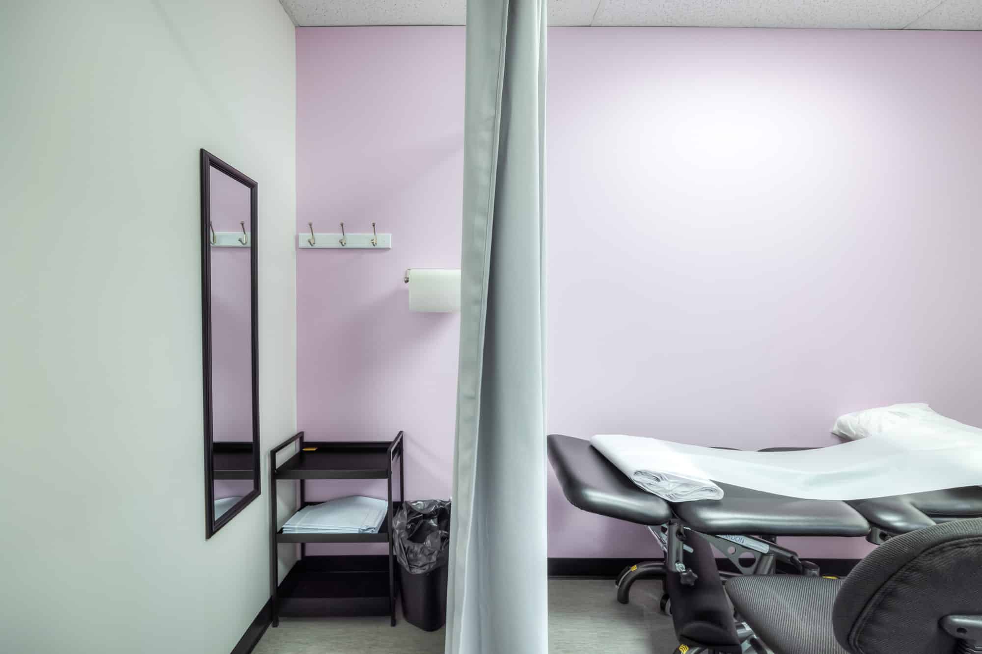
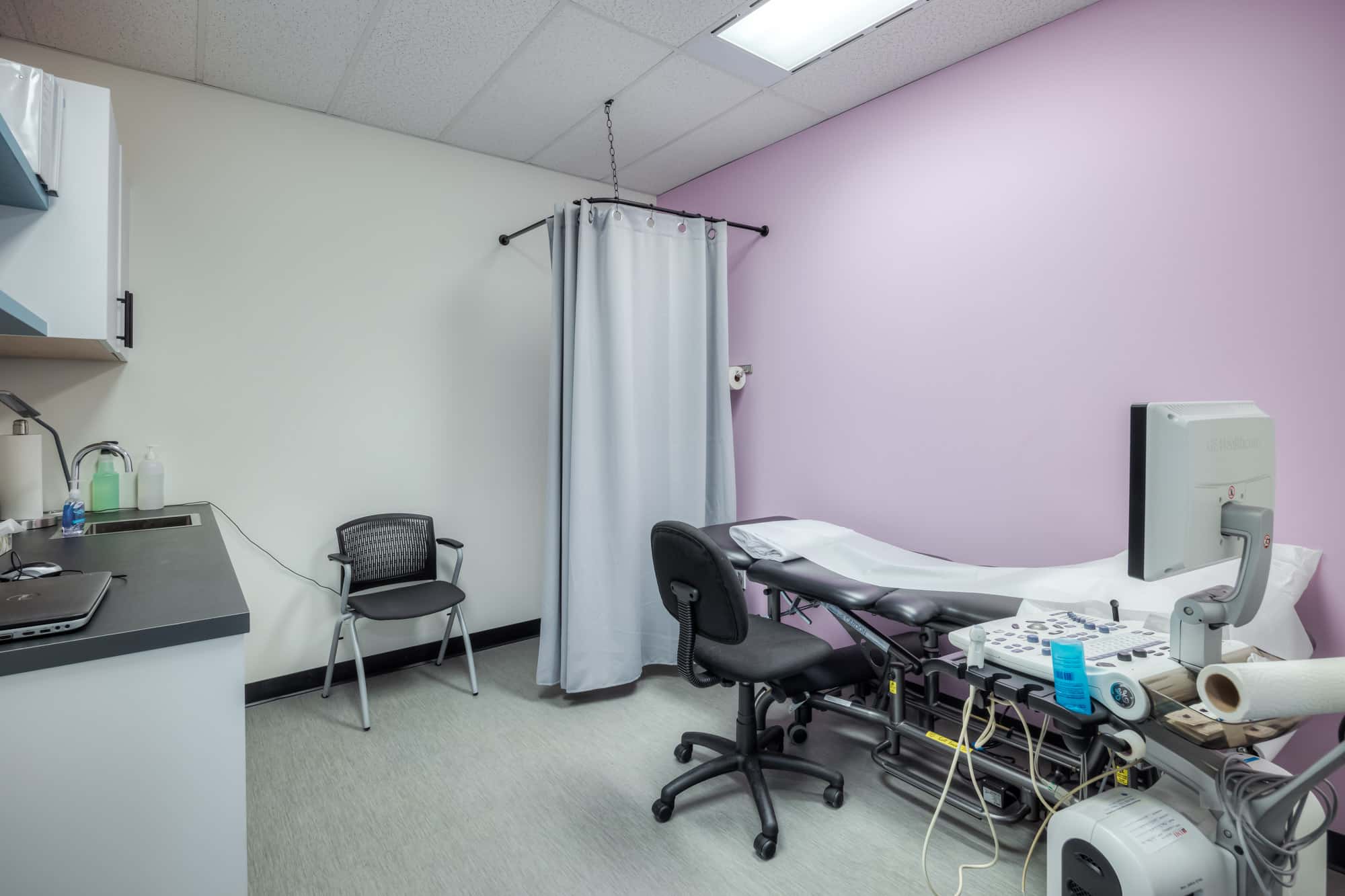
Exam Rooms Should Be Designed From the Procedure Outward
We don’t begin an exam room by deciding where the artwork goes.
We start with what happens inside the room.
What equipment is used?
Where does the clinician sit or stand?
Does the patient need to transfer onto a treatment table?
Which supplies need to be within arm’s reach?
Where is the handwashing sink?
Then we place the furniture around those activities.
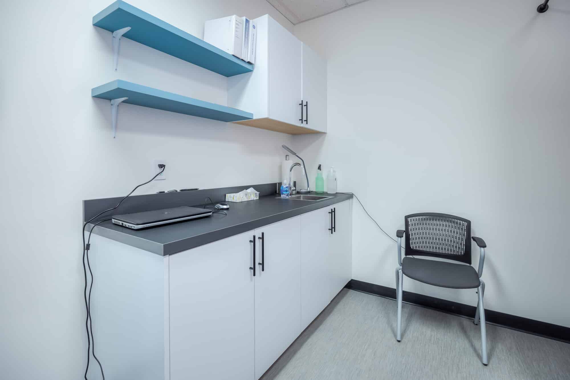
A room can meet a minimum dimensional requirement and still be incredibly frustrating if the clinician has to walk around the exam table every time they need a basic supply.
Those extra movements add up.
And if specialized medical equipment is involved, we’d want its actual dimensions and service requirements as early as possible.
Don’t design around a generic square labelled “equipment.”
Get the cut sheet.
Storage Is a Healthcare Design Issue
Clinics accumulate supplies quickly.
If storage hasn’t been planned carefully, the evidence starts appearing in corridors, under counters and on top of cabinets.
We calculate storage based on what actually needs to be kept close to treatment.
Frequently used supplies belong near the clinical spaces using them. Bulk inventory can often be located farther away.
The same principle applies to administrative storage.
Don’t use prime clinical square footage for records or supplies that staff access twice a month.
We’ve seen relatively small changes in storage location save a surprising amount of staff movement.
It’s not glamorous.
It works.
Privacy Is More Than Frosted Glass
Privacy often gets discussed as a visual issue.
That’s only half of it.
Acoustic privacy matters in clinics because conversations can involve personal medical information.
A consultation room with a beautiful glass door and privacy film may still perform poorly if people waiting outside can hear everything being said.
Wall construction, door seals, ceiling conditions and the location of louder versus quieter activities all play a part.
We consider privacy when zoning the clinic, before we’re trying to solve every problem with acoustic products later.
If a quiet consultation room shares a lightweight partition with a noisy staff area, we’ve made life unnecessarily difficult.
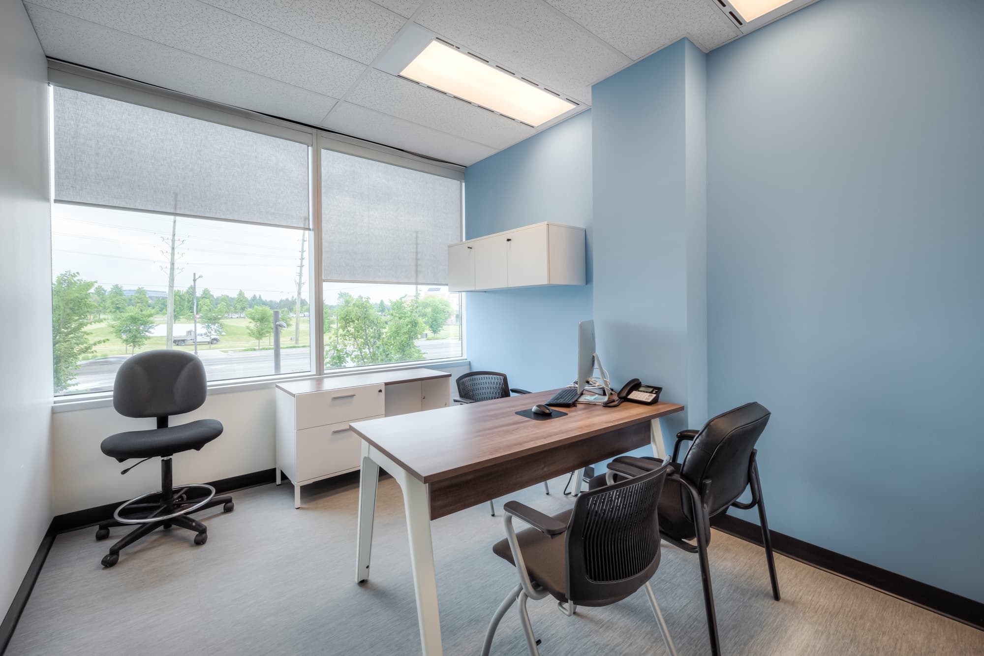
The Staff Area Deserves Proper Design Too
Healthcare projects can become so patient-focused that staff areas are treated as leftover space.
I don’t think that’s a good idea.
Staff may spend eight, ten or twelve hours in the clinic.
They need somewhere to step away from patient-facing areas, eat lunch, store personal belongings and reset.
Studio Forma’s healthcare portfolio includes staff spaces designed more like comfortable lounges than utility rooms. In several GNMI projects, warmer finishes and custom millwork were used to create break areas that feel distinct from clinical zones.
That separation matters.
A staff lunchroom doesn’t need to become another patient space.
Healthcare Furniture Has to Pass a Different Test
A chair can be comfortable and still be wrong for a clinic.
We look at cleanability, durability and how easily someone can get in and out of it.
The material matters.
So does the seat height.
The same applies to staff workstations.
A clinic may have administrative staff sitting for long periods, while clinical staff are moving constantly between rooms. Their furniture requirements are different.
There’s also the question of replaceability.
If the clinic has 34 waiting-room chairs, I’d rather specify something that can be maintained or replaced in a controlled way than a beautiful custom piece that’s impossible to match three years later.
Healthcare furniture needs a long memory.
The Clinic Design Process Should Start With Operations
A healthcare project benefits from a slightly different design sequence than a conventional workplace.
I wouldn’t start with Pinterest.
I’d start here:
Design Question | What We’re Really Trying to Understand |
What services are being provided? | Room types and clinical requirements |
How does a patient move through the clinic? | Public circulation and wayfinding |
How do staff move? | Workflow and adjacency |
What equipment is required? | Room size, power and services |
What must be accessible? | Layout and barrier-free planning |
What gets cleaned constantly? | Material and furniture selection |
Where is privacy required? | Acoustic and visual separation |
What needs to be stored nearby? | Millwork and supply planning |
Will the clinic grow? | Flexibility and future planning |
Once those questions have real answers, the design gets much easier.
Building Code and Permit Review Should Happen Early
Healthcare projects can trigger significant technical coordination.
Accessibility, washroom requirements, fire separations, occupant loads, plumbing and mechanical systems may all affect the project depending on the building and scope.
Ontario’s current Building Code establishes accessibility requirements for applicable new construction and extensive renovations, including barrier-free travel and accessible facilities.
That’s why we don’t want to discover a major code issue after the clinic layout has been completely designed.
Maybe a corridor needs to change.
Maybe a washroom needs more space.
Maybe moving one wall changes something elsewhere.
Solve it early.
Paper is cheaper than construction.
Equipment Coordination Can Drive the Room
This becomes especially obvious in diagnostic imaging.
Studio Forma’s 10,000-square-foot Toronto GNMI project needed to support advanced imaging services while separating public and clinical zones and maintaining operational efficiency. Durable materials and antimicrobial surfaces were integrated into that planning rather than added after the clinical layout was complete.
The equipment comes with requirements.
Those requirements affect the architecture.
That’s the order.
Trying to force specialized clinical equipment into rooms that were designed before its needs were understood creates compromises nobody enjoys.
The Clinic Shouldn’t Feel Like the Code Checklist
Here’s the balance we aim for.
A clinic has to work.
It has to be accessible. Materials need to survive. Privacy needs to be considered. Equipment has requirements. Building systems and permits matter.
But patients shouldn’t walk through the door and feel like they’re standing inside a technical specification.
The operational requirements should sit underneath the experience.
At Hope Medical Clinic, the century-home character wasn’t erased just because the space became healthcare. At GNMI, clinical-grade surfaces are paired with warmer materials and lighting. At BOXXED Aesthetic Clinic, privacy and treatment functions were integrated into a more hospitality-driven environment.
That’s where good healthcare interior design gets interesting.
The technical part and the human part need to exist in the same room.
What We Would Review Before Approving a Clinic Layout
Before we sign off on the plan, we mentally run the clinic through a busy day.
A patient arrives using a mobility device.
Another is checking in.
Someone needs the washroom.
A staff member is bringing supplies toward an exam room.
Two patients are leaving.
The phone is ringing.
Does the layout still work?
That’s a much better test than looking at the plan with every chair pushed neatly under the desk.
If the design works only when nothing is happening, it doesn’t work.
Planning a Clinic Renovation?
If you’re renovating an existing clinic or building a new one, start with operations before aesthetics.
Understand the patient journey. Map staff movement. Confirm accessibility early. Get actual equipment information before the rooms are finalized.
Then choose materials that can survive the way the clinic will actually be cleaned and used.
Studio Forma works across healthcare interior design, permit drawings, construction documentation, furniture procurement and project coordination for clinics and medical facilities throughout Toronto and the GTA.
And if I had to give one piece of advice before signing off on a clinic layout, it would be this:
Don’t approve the rooms individually.
Walk the entire patient visit from the front door to the exit.
That’s where you’ll find the problems worth fixing.
Frequently Asked Questions (FAQ):
How does ergonomic furniture benefit clinics?
Ergonomic furniture enhances patient comfort during long waits or procedures while reducing physical strain on healthcare professionals working extended shifts.
Can commercial interior design improve workflow efficiency?
Yes! Commercial interior design optimizes layouts to streamline transitions between different areas of the clinic—saving time for both staff and patients.
Why is hiring a clinic interior designer important?
A clinic interior designer helps to create welcoming environments that reduce patient anxiety while supporting staff productivity through thoughtful layouts and furnishings.